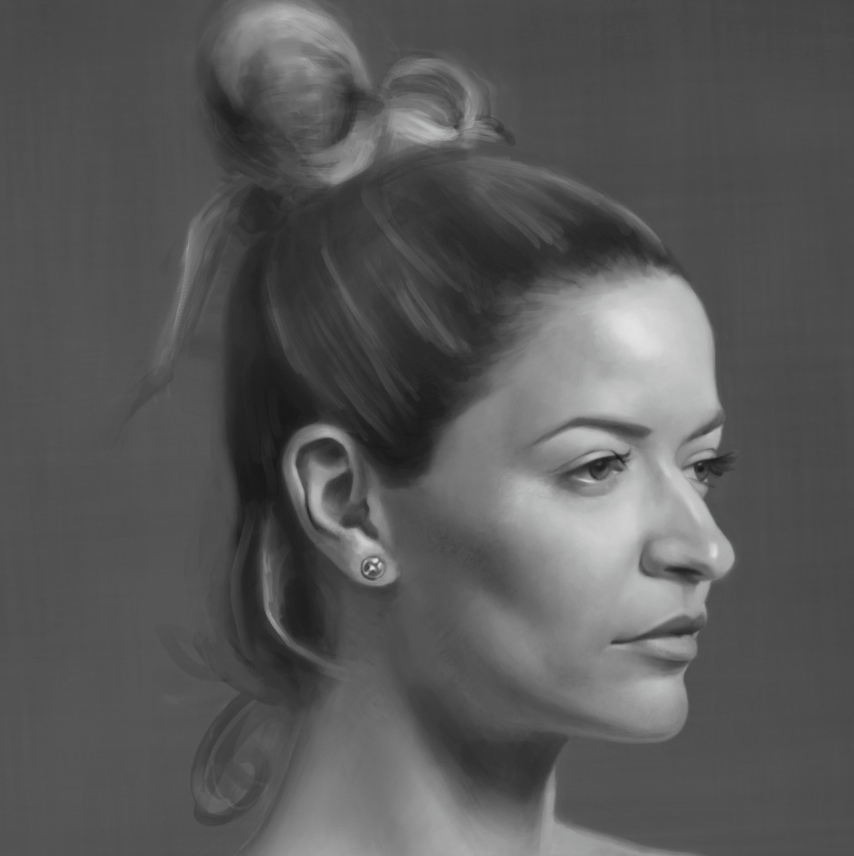
NMA Student Artwork Showcase
This dedicated space proudly showcases the exceptional talents of New Masters Academy students.
From intricate sketches to awe-inspiring masterpieces, every piece is a testament to the student's dedication, passion, and unique artistic journey.
Dive deep into this ever-evolving collection, discovering a diverse range of disciplines, techniques, and the personal narratives that breathe life into each artwork.
Let their artistry inspire, challenge, and propel you forward in your own creative journey.

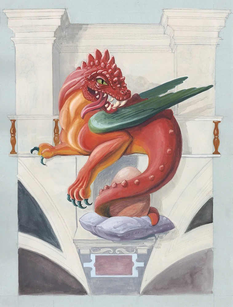
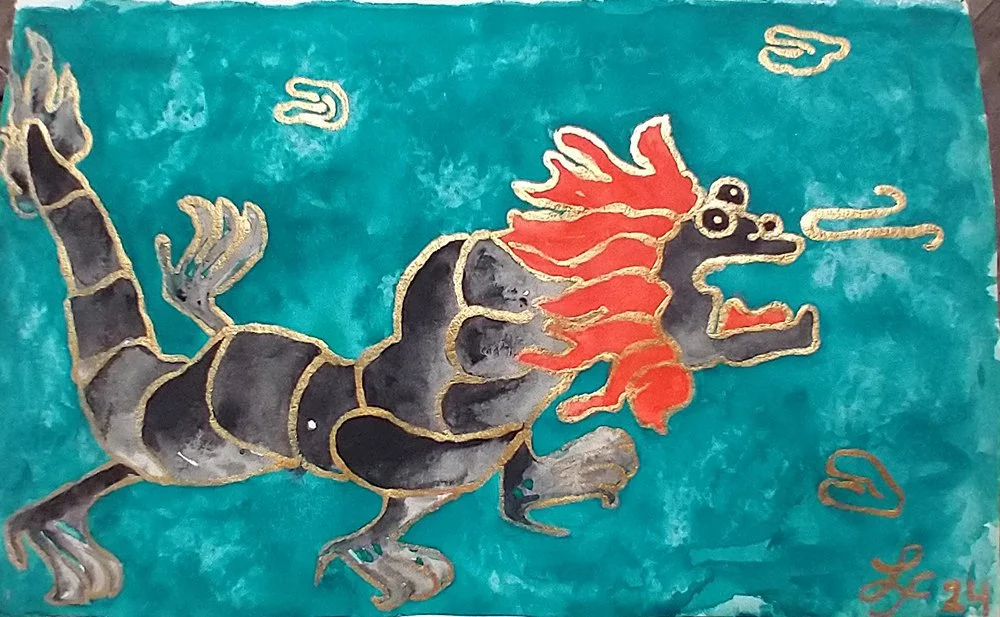
NEW MASTERS ACADEMY PRESENTS:
DRAGON ART QUEST:
A STUDENT ARTWORK COMPETITION
In honor of 2024 being the Year of the Dragon, the Dragon Art Quest Exhibition presents a mesmerizing collection of student artwork, celebrating this symbol of power, strength, and good luck within the Lunar New Year festivities.
As part of the festivities, viewers are invited to explore this fantastical realm and contribute to the celebration by voting for their favorite submissions, with the opportunity to cast their votes from now through Monday, March 4th, 2024.
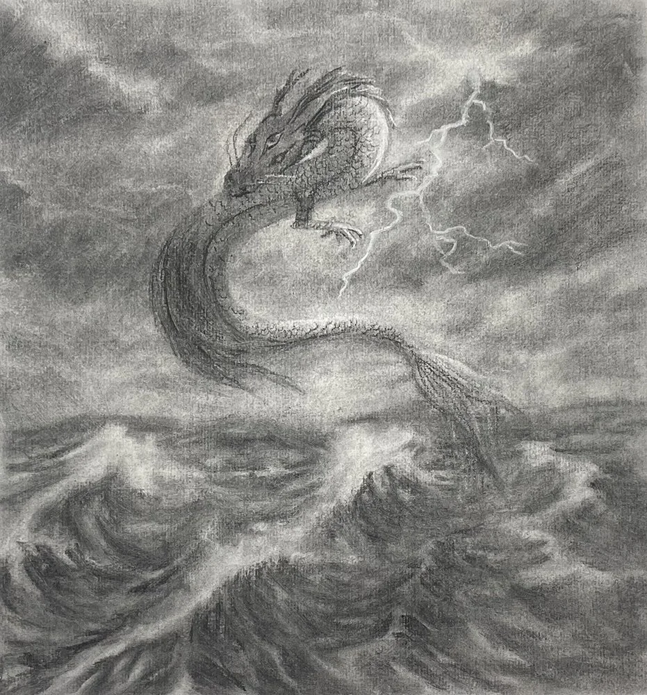
Student Submissons
-
![]()
TOP FAVORITE AS VOTED BY THE COMMUNITY
-
![]()
Student Artwork IV - TOP FAVORITE AS VOTED BY THE COMMUNITY
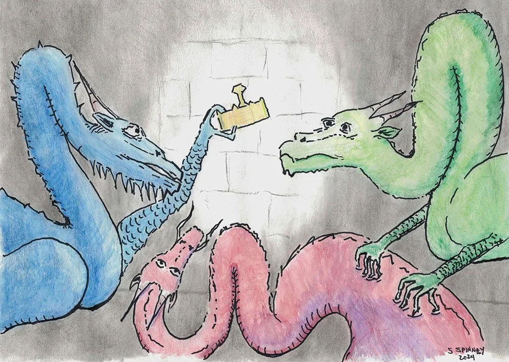
-
![]()
Student Artwork I
-
![]()
Student Artwork II
-
![]()
Student Artwork III
-
![]()
Student Artwork V
-
![]()
Student Artwork VI
-
![]()
Student Artwork VII
-
![]()
Student Artwork VIII
-
![]()
Student Artwork IX
-
![]()
Student Artwork X
-
![]()
Student Artwork XI


Explore the creative insights and ideas behind each submission:
Dive into the students' submission write-ups to uncover the inspiration and thought process that fueled their artistic endeavors!
Gingerbread Artwork Competition
This special showcase features a diverse array of submissions from our recent art prompt challenge, where participants have ingeniously transformed a gingerbread theme into captivating works of art.
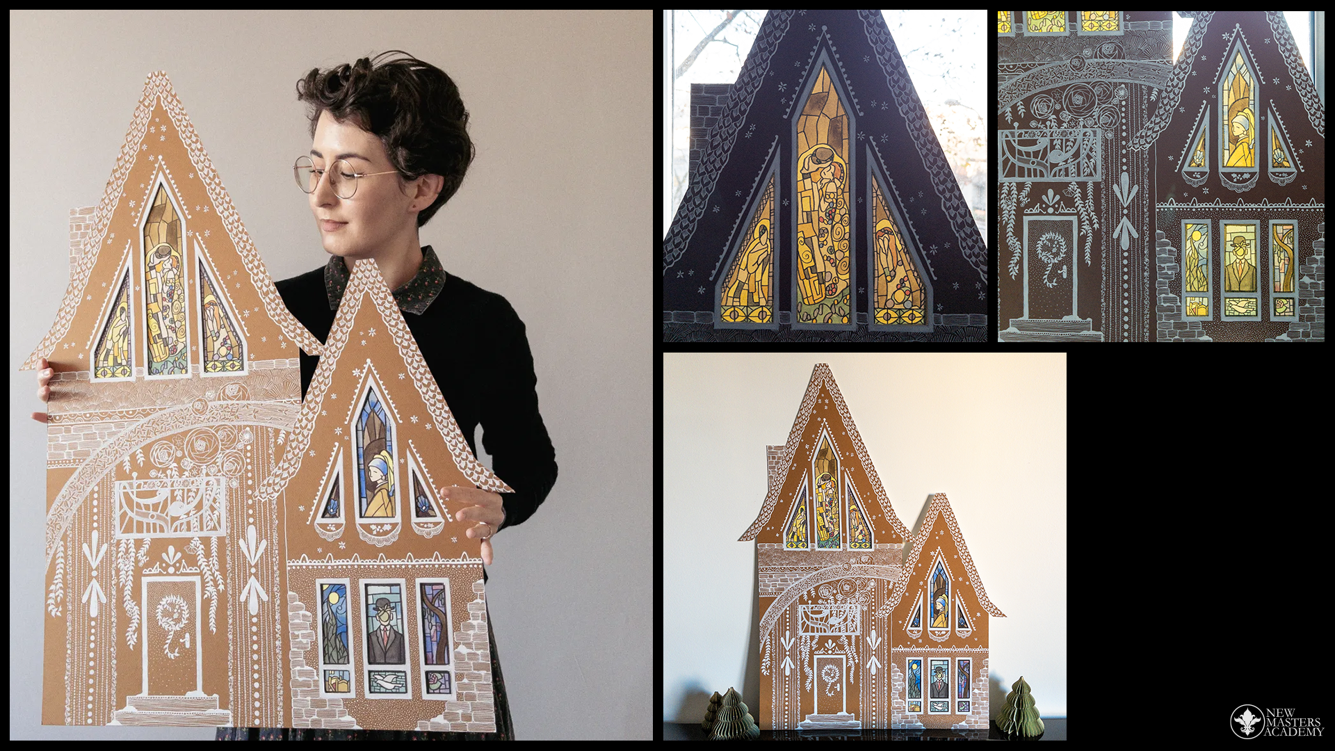
-
![]()
🏆 JULIE MOURVILLIER 🏆 COMMUNITY-VOTED WINNING SUBMISSION
“As must all enchanted habitations, this gingerbread house emerged from the unexpected. Materials were initially purchased for another purpose. Its size didn’t fit any sketching or planning method, so it had to be structured on the spot. The architect didn’t know where to start. Roses started to grow from the balcony before windows even had frames, and patterns of lace and stars and bricks and snow developed on the roofs and walls. At the very end, famous works of art brought life to the windows, and light revealed the house’s magic.”
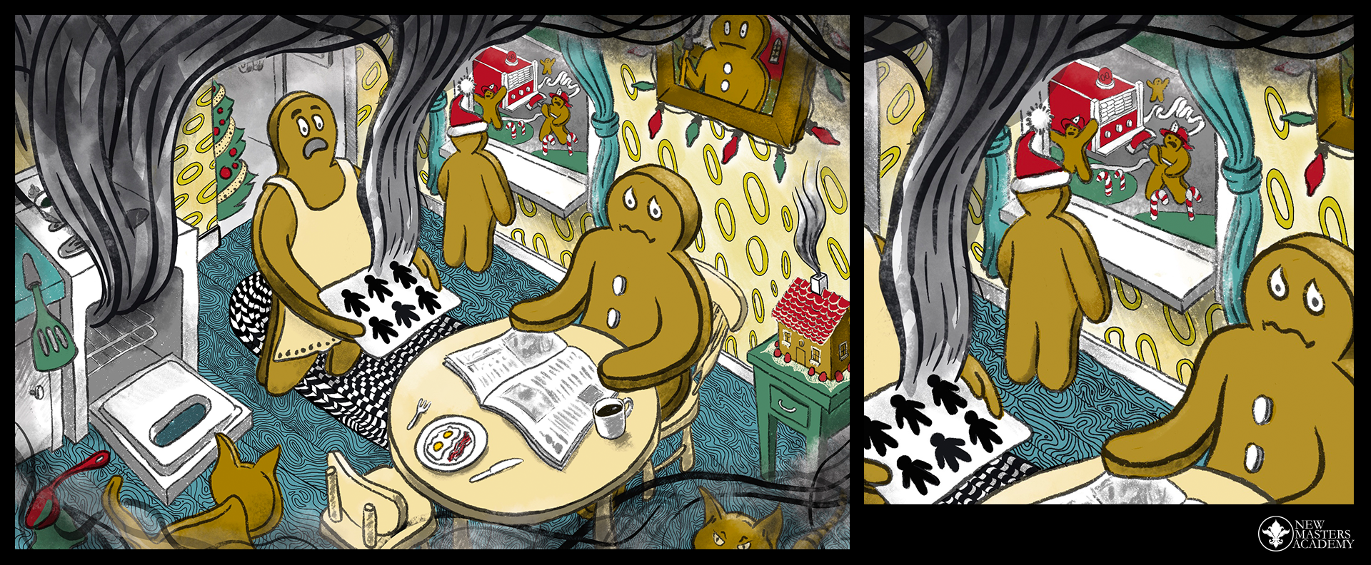
-
![]()
PATRICK JOHNSON: 🏅 The "Gingerbread Narrative" Award
“Hi! After many doodles, this is the first time I have ever really buckled down and tried to create a "finished" piece of digital artwork. There were many false starts and restarts. Eventually, I did find a way to work that leans into my graphic design background – I focused more on composition and textures than on volume or rendering or line quality. At one point I thought I would keep it as a black and white piece, but using color actually was a lot of fun towards the end. And after a while I did start to feel like I got some hang of the tools and began to loosen up. The concept lends itself to an approach that felt pretty over the top and frantic, so I went with that. It ended up being excellent extended practice with the apple pencil for my line quality.”
Procreate on an iPad pro with a broken screen :)
Discord - @Peej_pixnit
-
![]()
SUBMISSION III: 🎖️ The "Flavorful Fairy-Tale Fantasy" Honor
“Hi there! I made a gingerbread house entirely from polymer clay. I hand made a template and then used it to cut the clay. I made the clay walls look like gingerbread by adding soft pastel shading. I then baked the walls and stuck them together with glue. After that I made some additional decorations including the candy canes you can see adorning the walls. I also made some gum drops and mini cookies but burnt them so they were unusable making my own house very stinky! 🤦♀️😂 After a few rude words and some tears, I decided that I could still salvage my original design and added the candy canes with glue. I then put kitchen silicon into a piping bag with a star tip and piped the icing on the roof, walls, and backside of the house. To finish I added the strawberry slices on the top of the house and some very fine translucent glitter to look like sugar! Thanks for looking at my entry.”
-
![]()
ARACELI TATARCZUK: 🏅 The "Cozy Cookie Creation" Award
“I approached the theme as if creating a page for a children's book. I designed a scene where multiple characters had gathered together to bake and craft, and I tried to keep the gingerbread house as the central focus of the composition. I used a combination of traditional and digital painting to bring this scene to life.”
-
![]()
SARA GRACE: 🎖️ The "Whimsical Wonderland" Honor
Winter Fun
“Taking my first steps into the magical world of children's fantasy illustration with this gingerbread and dessert inspired scene.”
8x10 Watercolour on Arches Coldpress
6 colour limited palette
Instagram: kiwigrace.art -
![]()
ISSA DIMAYUGA: 🏅 The "Fantastical Heritage Harmony" Award
“I thought I’d showcase something from my home and turn it into a gingerbread house. This painting is inspired by the “Bahay Kubo” a pre-colonial type of structure in our country, usually a house. It is built using local and light materials such as bamboo and nipa grass. The decor hanging on the corners of the roof is called “parol”, it is an ornamental lantern we usually display during the Christmas season, which signifies hope. There are illuminated ones which are pretty popular as they genuinely are beautiful when lit up at night.”
-
![]()
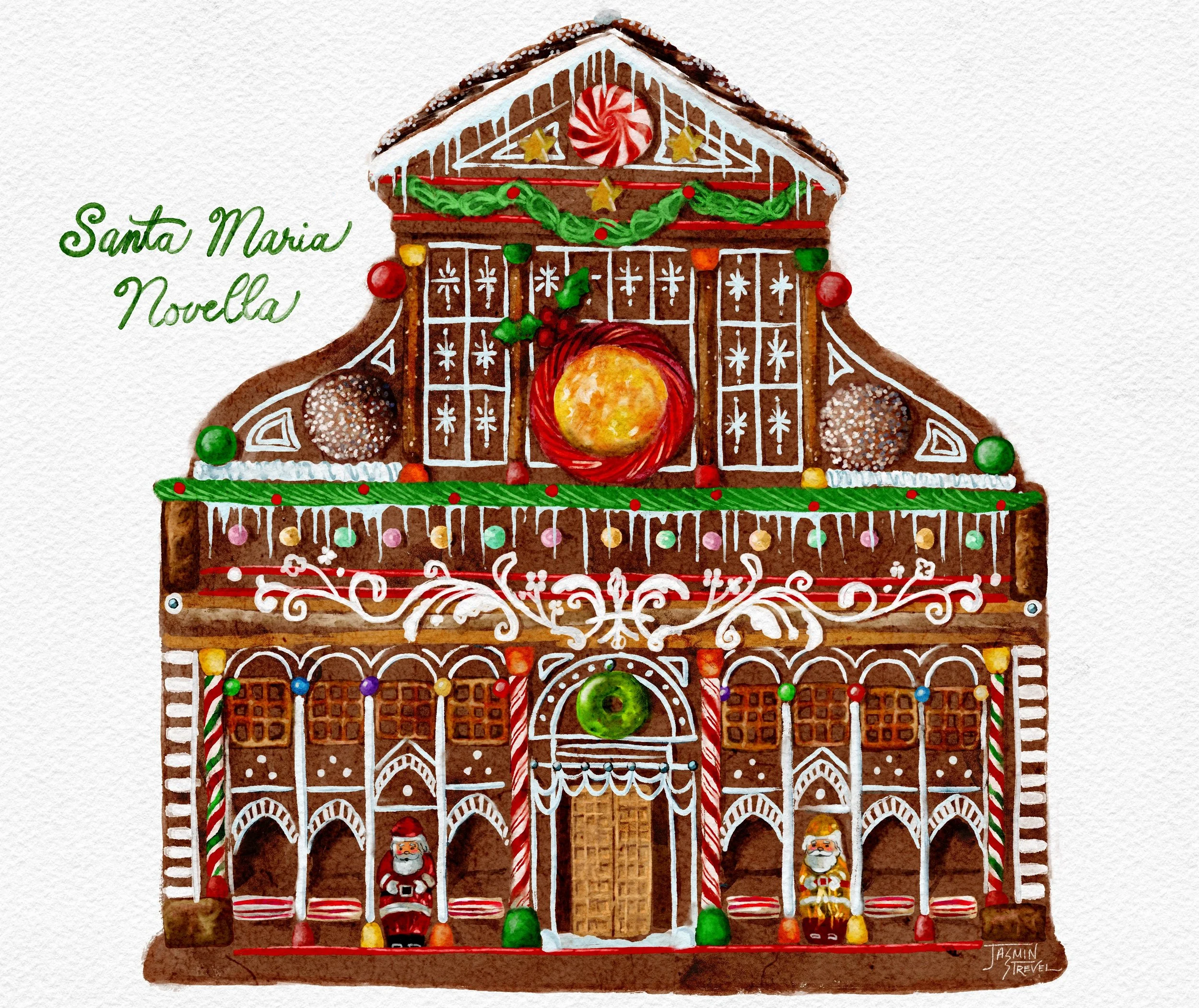
JASMIN STREVEL: 🏅 The "Scholarly Sweet" Prize
“I wanted to design a gingerbread house based on a Leonardo da Vinci design… after searching a bit farther back I found a basilica in Florence that would look SWEET with a Christmassy renovation. It turned into more of a research project, looking into it‘s many designers (Alberti) and amazing history. There’s an added astrological aspect and great art filling it’s cloisters- Leonardo also did a large drawing here. I also imagine it would be a great multi-studio space for the hardworking gingerbread people. This was a chance to try some new digital brushes, sit with nostalgia, and even satisfied my need to build a real gingerbread house this Christmas! Thanks NMA.”
-
![]()
MICHELLE GATES: 🏅 The "Edible Spectacular Sugar-scape" Award
“I was inspired by a recent visit to the MET with some of the American interiors from the early 20th Century. I was inspired by Frank Lloyd Wright's desire to harmonize with the local landscape, but by using various rectilinear forms. I set about to create an edible landscape using melted milk chocolate, white chocolate, butterscotch, and candy. Some of the plantings are inspired by local native plants, such as black eye susan and winterberry holly. I created the house using cardboard and decorated it with white gouache to simulate icing.“
-
![]()
AMÉLIE DONNY: 🎖️ The "Fantasy Frosting" Honor
“Oh no! Our poor gingerbread artist was so occupied to have fun that he couldn't finish the painting of his own house! Who knows maybe he will manage to finish his watercolour painting before the end of the deadline? A Christmas miracle can always happen!”


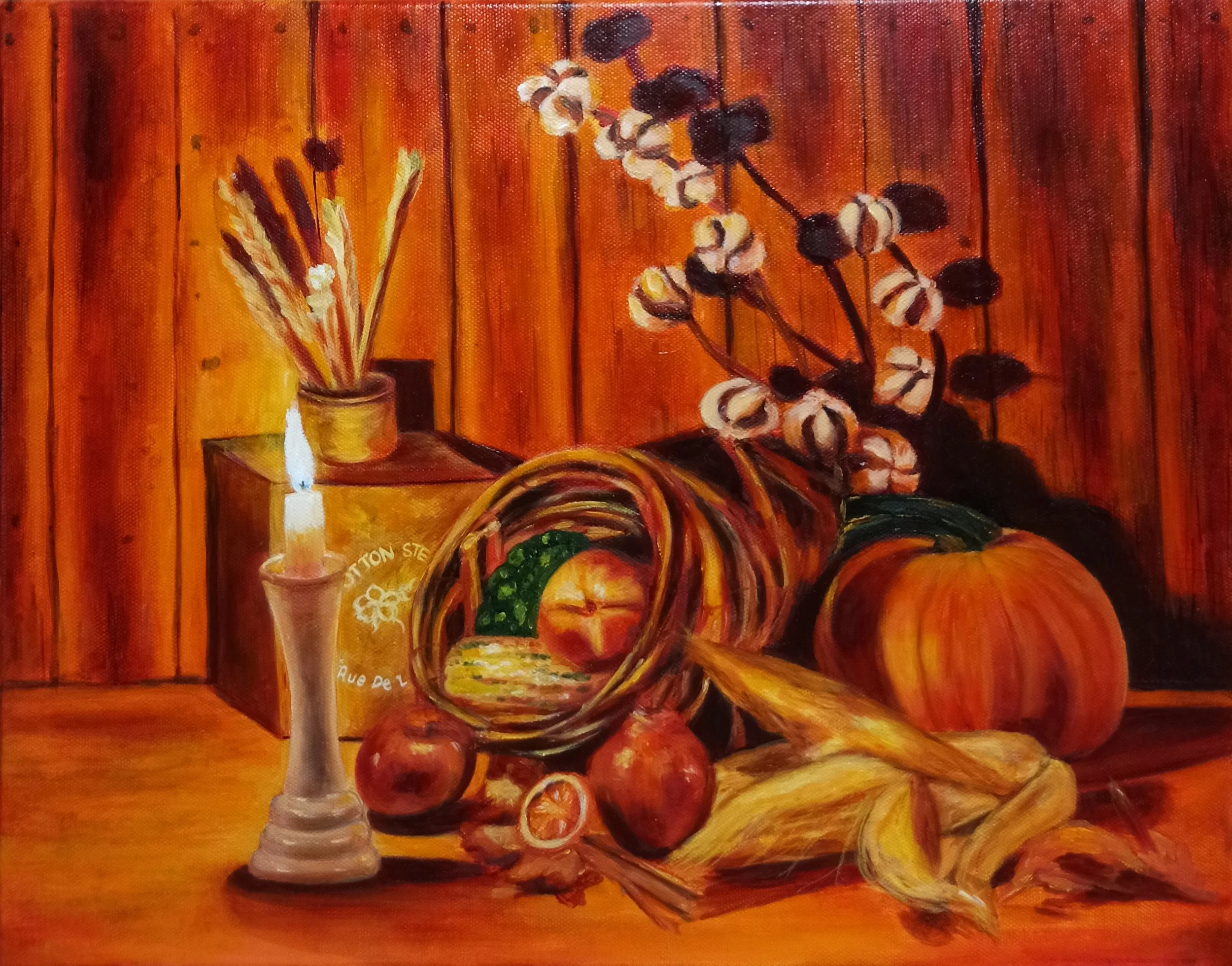
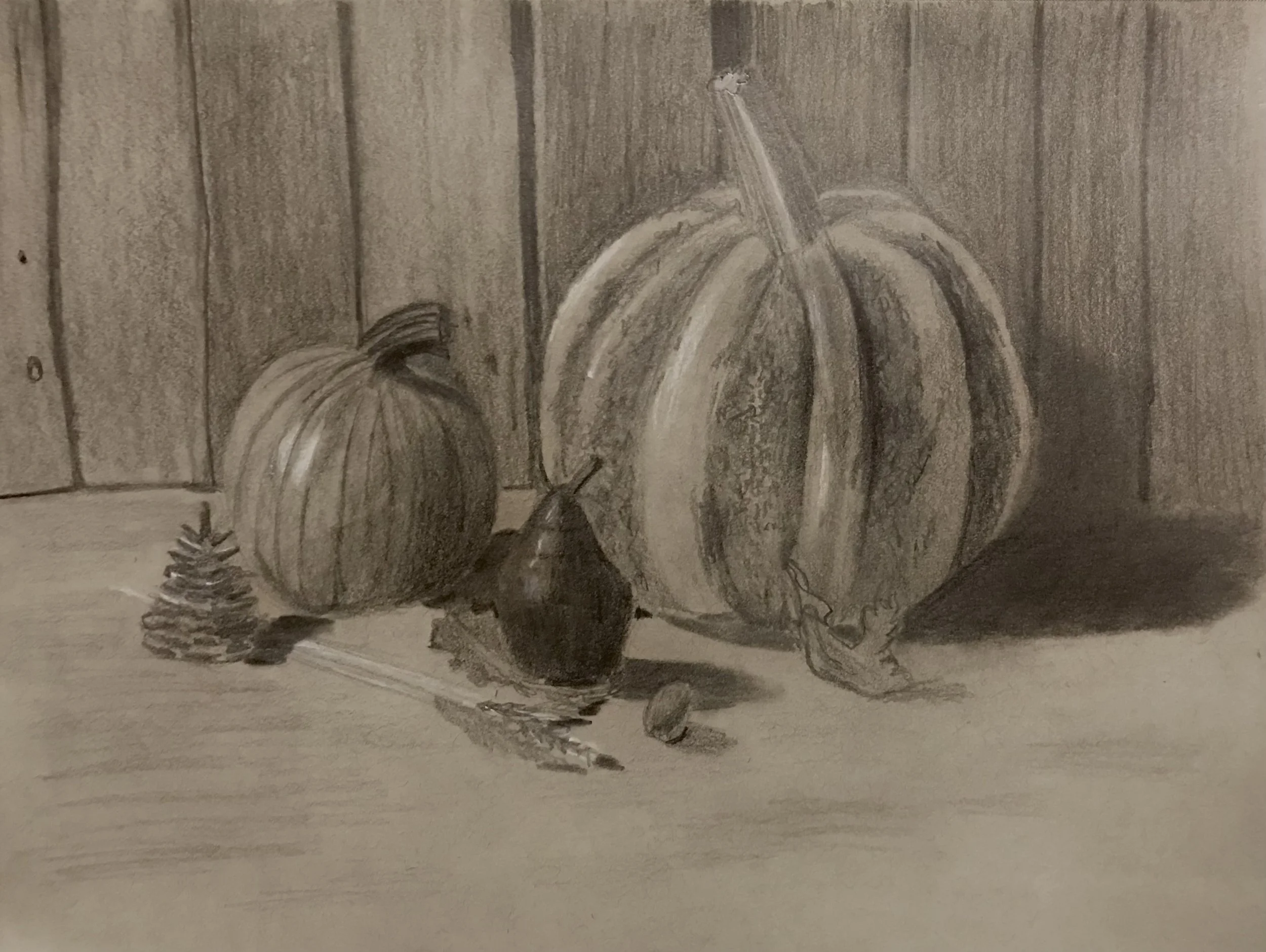
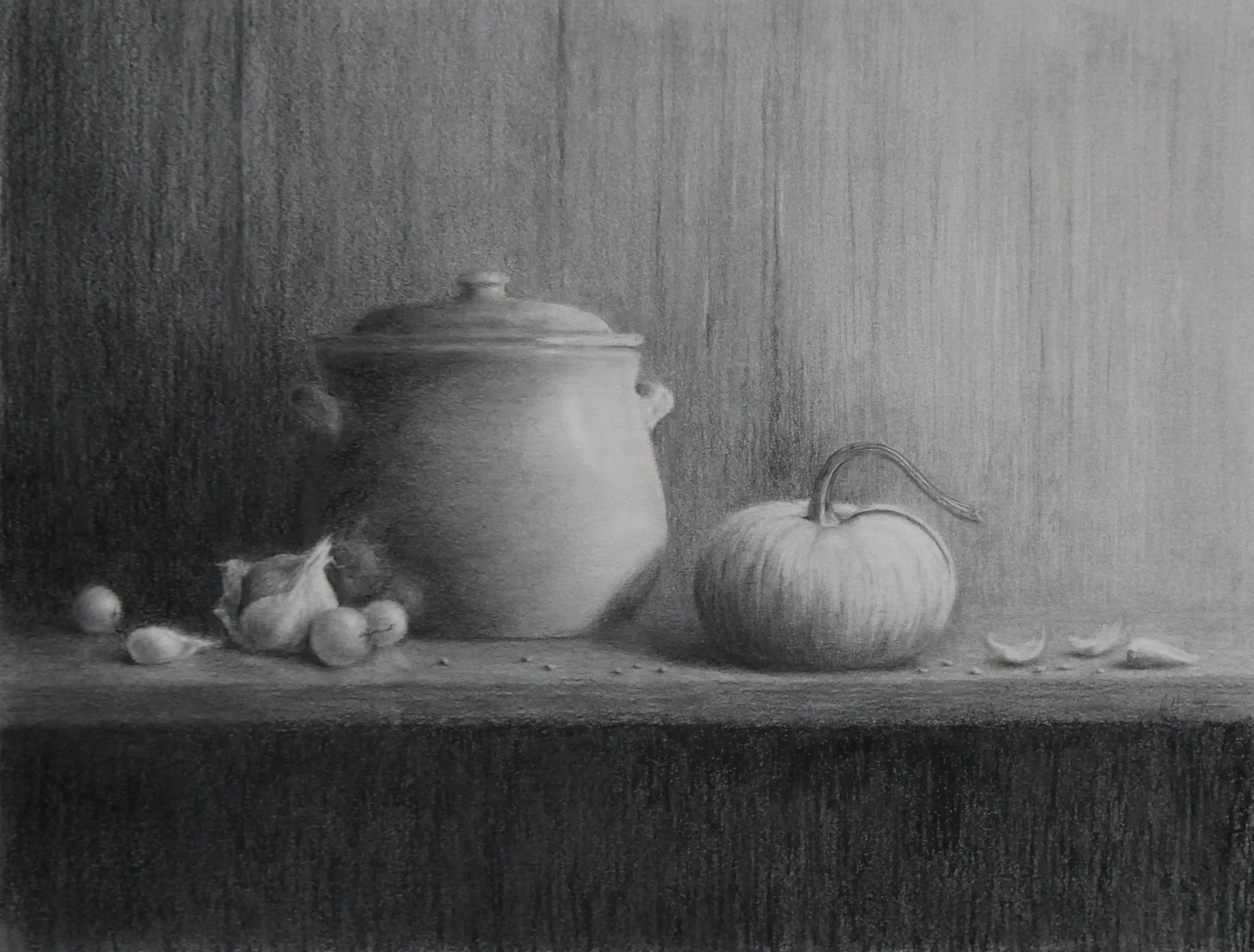
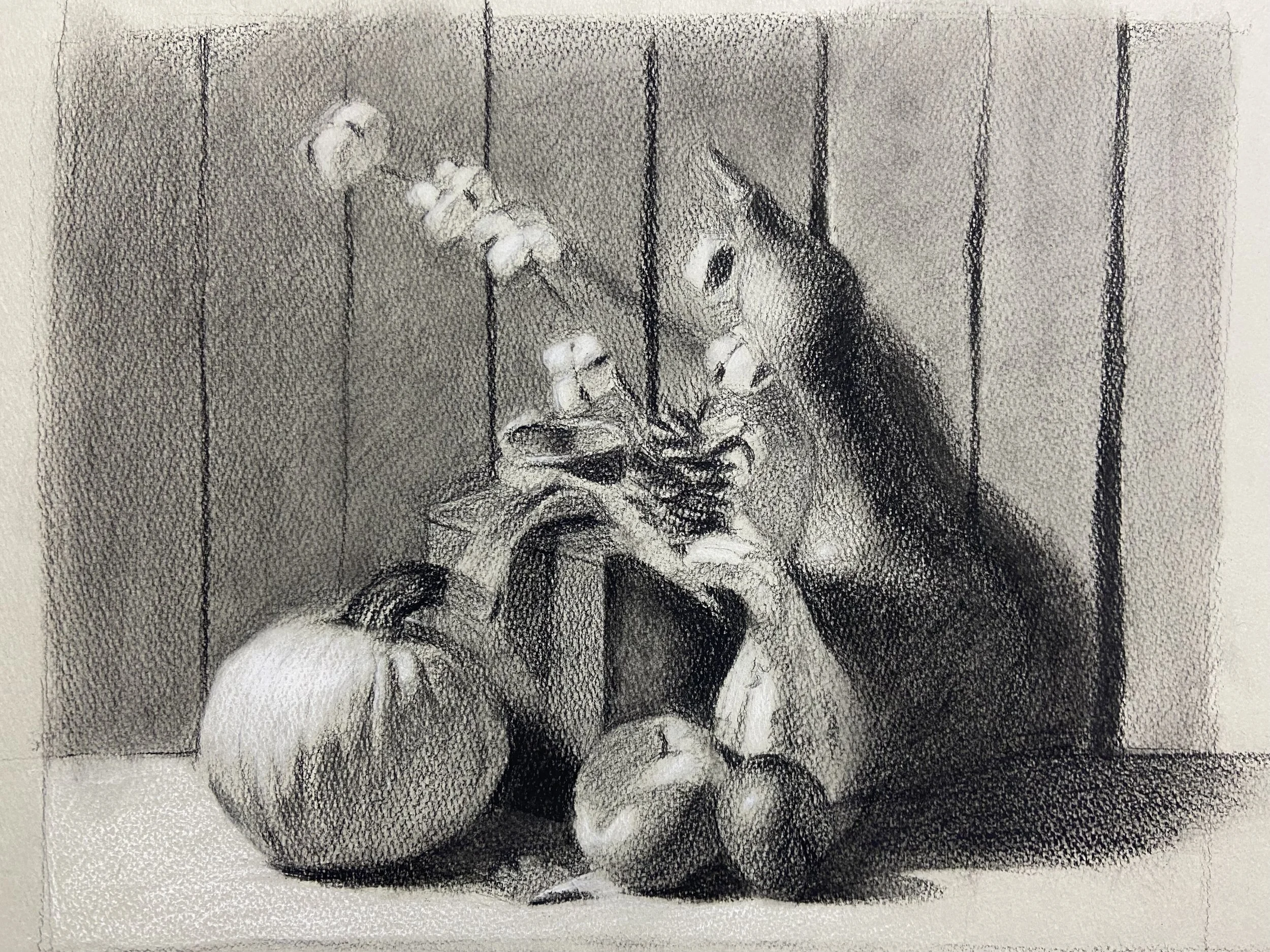
Class of 2027 Assignment II: Harvest Bounty Still-Life
-
![]()
Lydia R.
“I made this painting in procreate on ipad. I start with broad shapes and colors to get the placement of things. Then I work on different areas of the painting individually while trying to keep in mind the relative values and separating each object into light and dark. Throughout I adjust the values and colors of the things I have painted.”
-
![]()
Andreia S.
“To create this image, I adjusted the framing of the photograph and enhanced shadows on the right side. I utilized Conte pencil on rough canson paper, and unfortunately, it's a medium I couldn't erase. Nevertheless, I had to embrace all the mistakes that came with it.”
-
![]()
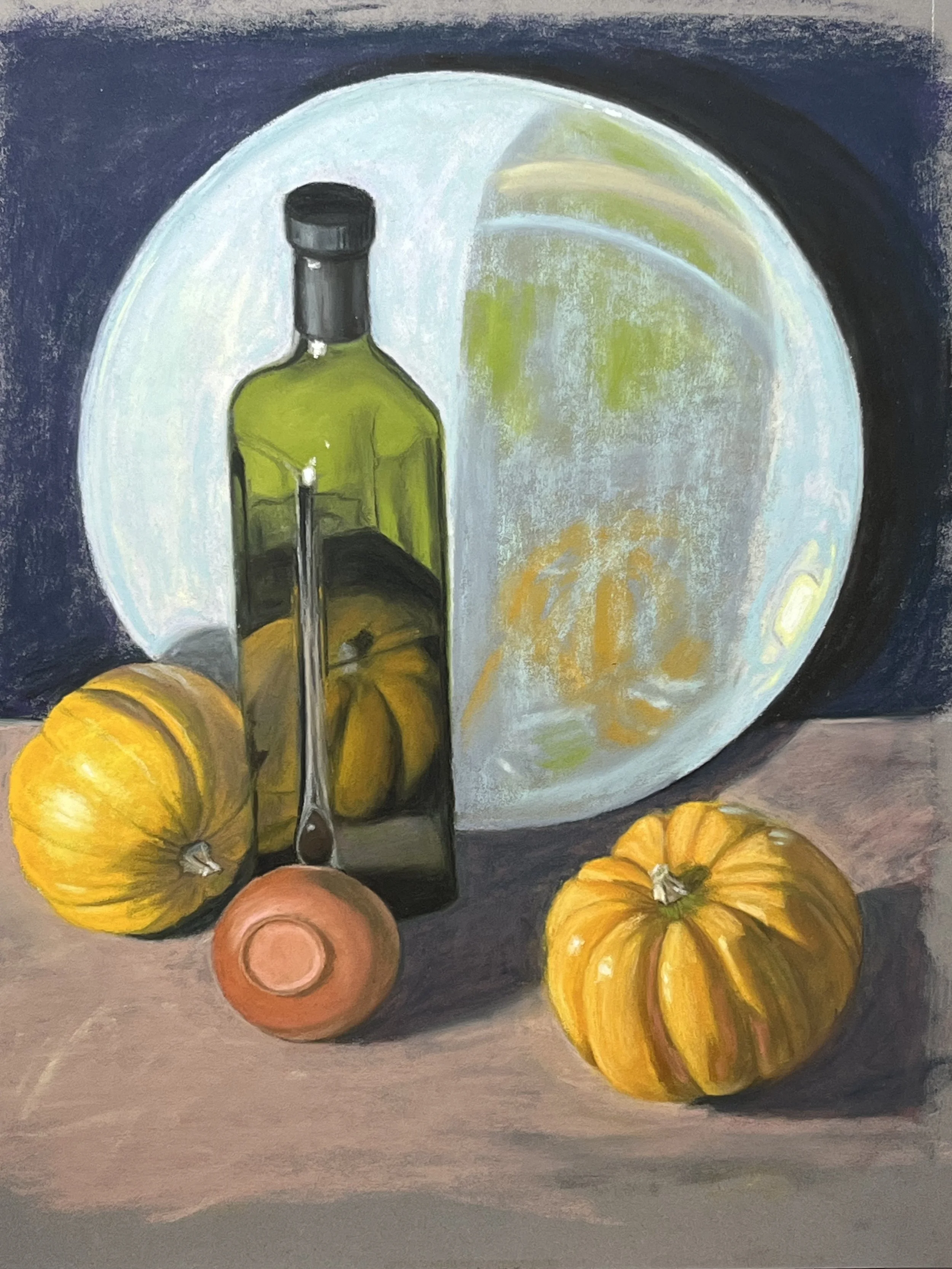
Christa F.
“Where I live, autumn isn’t really a big thing; we don’t have access to many autumn vegetables, besides I am really slow and any fruits or vegetables would have decayed long before I was done. So, I chose a supplied reference image; well, I combined and altered them until I found a setup I really liked.
The first thing that stood out was that this still life needed to be done in color rather than black and white, which I normally draw in. I have almost no experience with color. Also, I thought it would look really good in gouache. I had zero experience with that. I tried a sample drawing and it was clear I wouldn’t be able to learn gouache in such a short time. I have used charcoal and grey pastel pencils, so I went with colored pastel pencils.
Trying to match colors was really difficult. I didn’t get it exactly right, but I am pleased with this first effort. Also, I would liked to have had darker shadows on the objects.
I started by using a classical approach to making the under drawing on a big piece of paper then transferring it to pastelmat using white transfer paper. I practiced coloring on scrap paper before working on the pastelmat. The colors don’t match the references but are nice when comparing the objects and backgrounds with each other.”
-
![]()
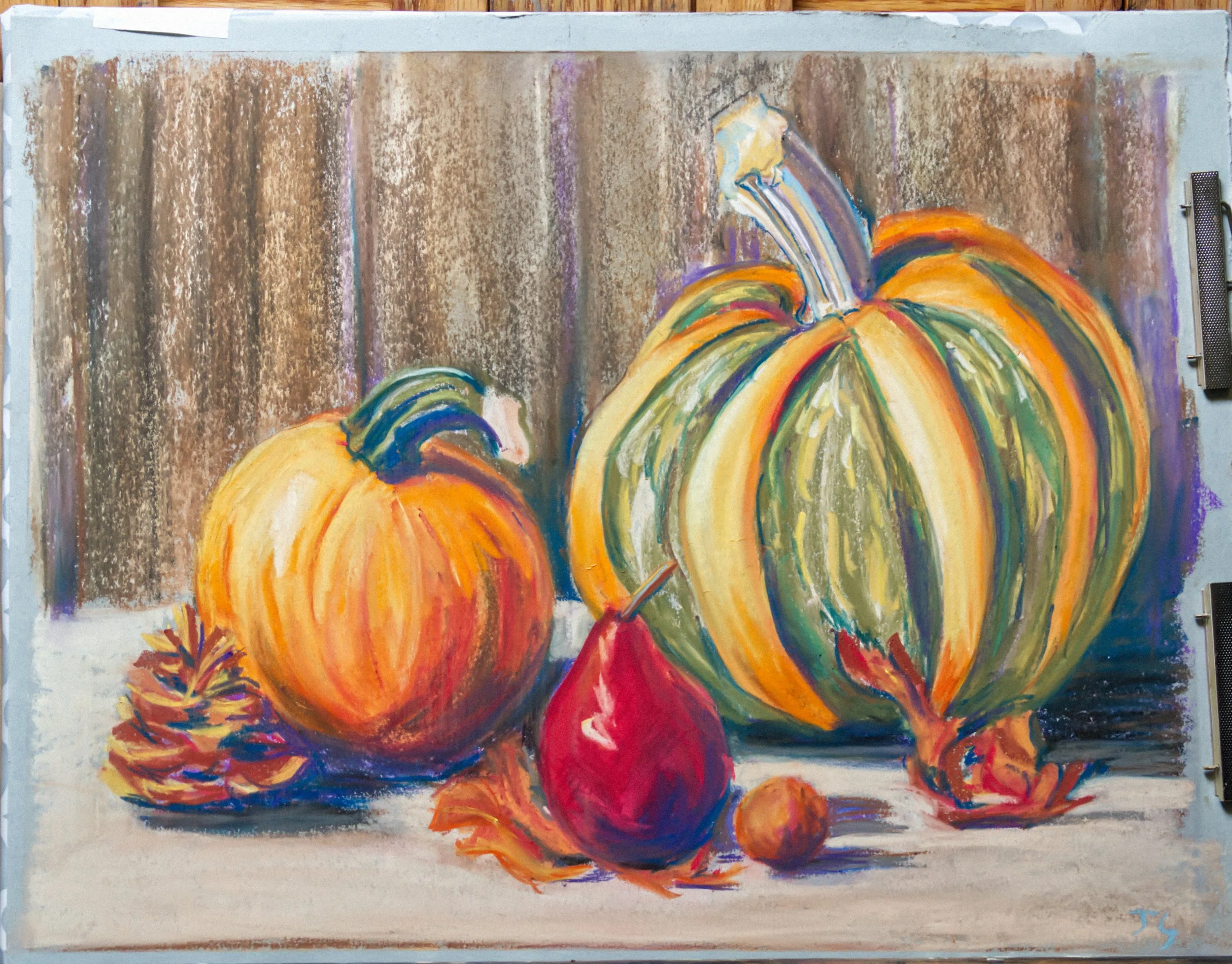
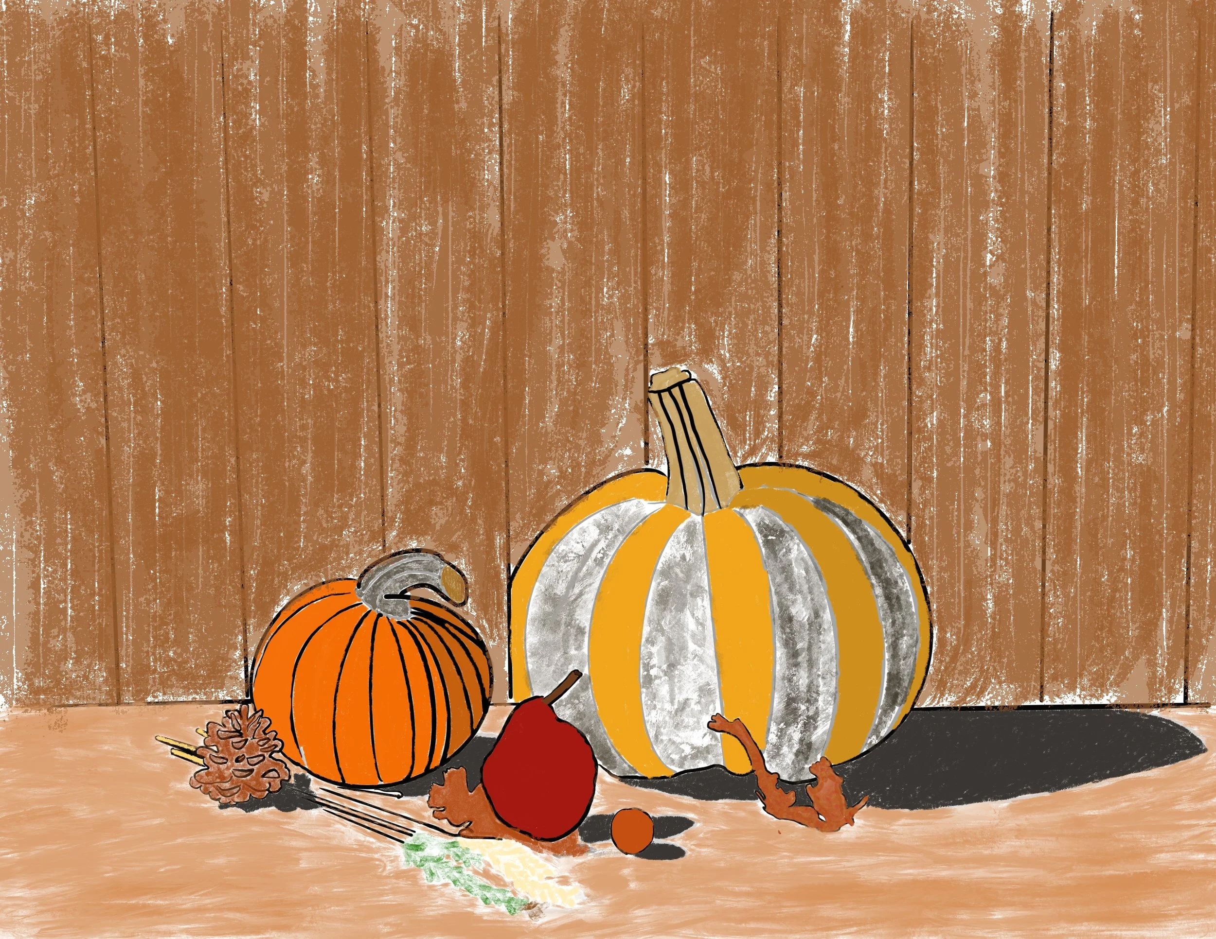
Michelle G.
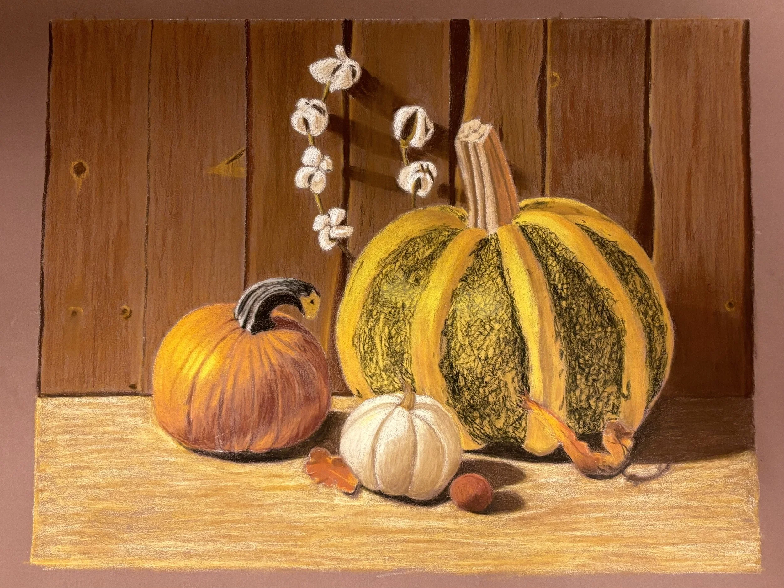
“I found my pumpkins when I took my kids to a local pumpkin patch. I noticed the interesting curled tendrils on a small, white pumpkin that I wanted to showcase. I know that getting the shading right on a white object can sometimes be challenging, so I thought that would be fun to tackle. I also picked out a small, heirloom pumpkin that was covered in what botanists would call "glauca", which is a bluish white wax. If you were to look at the structure that produces the wax under a microscope, you'd find that the wax is produced at the tips of a bunch of little bumps. This structure makes it so the whitish wax is most visible when the surface coated in it is perpendicular to you. It's the same wax that makes blueberries a blue-white; it can show up on grapes, cacti, plums, and some of the "blue" conifers. Most of the pumpkin was a dark green, but the edges took on a very light blue color from the wax, and there were hints of orange in places as well. I knew the pumpkin's unusual colors and transitions would make for an interesting challenge to paint. I also picked up a small sack of mixed ornamental gourds so I would have options for setting up a good still life.
The area that has the best lighting for a still life is a different room than my studio, so I experimented with different still life setups and took photos until I had a composition I was happy with. I wanted to include a metallic element, so I tested out a copper jug as well as a brass platter that has been engraved and embossed with a design that contains a lot of circles. I ended up arranging the platter so that one of the circles on the platter framed the stem of the central pumpkin. I placed the white pumpkin on the left where I could silhouette the tendrils against a quiet background. Swapped in a couple of different ornamental gourds, and decided I wanted a small, mottled green one. I also decided to place the final gourd on an angle so that I could see the dark stripes coming in toward the stem. I wanted a little bit of variety in the gourd's silhouettes.
I decided to arrange the gourds into a group of three with the bases forming a shallow arc rather than a straight line. I wanted them to overlap to establish depth. I decided to include a cluster of reddish-purple grapes in the foreground to further establish depth and to create an element that would lead the eye up towards the pumpkins. I tested a few different lighting setups, but decided on one that lit the pumpkins from the side and slightly in front, which gave me some lost edges to work with.
I really liked a long, horizontal format, so I asked Marian on Discord if I could paint on a 20" x 10" canvas. (The assignment says at least 14" x 11", so this is a larger canvas in terms of square inches, but it's a slightly different dimension.) She said it was OK, so I cropped the photo in GIMP to a 2:1 ratio and printed out the photo at half size. I didn't save my exact crop - just printed it. I ended up approximating the crop in the uploaded file here to reduce file size.
From there, I toned the canvas with raw sienna. I used the brown Faber Castel Pitt pastel that came in the NMA box to sketch the design onto the canvas and to block in the major shadows. I measured a few key points, such as where the tablecloth transitioned to the dark cloth background on the left edge and where the platter intersected the top and right edges. Beyond that, I just eyeballed it. I made some minor changes to the placements of the grapes, for example, so they would read better.
I decided to use the following acrylic paints:
Titanium White
Quinacridone Magenta
Indanthrene Blue
Cadmium Yellow Medium
Raw Sienna
Burnt Umber
This is pretty similar to the pallet I use when I go plein air painting, so I'm pretty familiar with these particular colors mix together. I ended up painting the still life over the course of 4 painting sessions.
On the first one, I handled the background fabric, the brass platter, the white pumpkin, the tablecloth (including the shadows on it), and the grapes. I chose to alter the color of the cloth background from dark blue to dark purple to better harmonize with the grapes. I decided to avoid trying to paint in the various creases and midtones on the cloth in order to create an area of rest. I also blocked in some of the lighter colors on the remaining pumpkin and the gourd using some of the paint on my pallet to note where it was and to use up some of my last bits of paint because you can't save acrylic from day to day the way you can with oils or even watercolor or gouache.
On the second session, mostly painted the mottled green gourd, but I also added some more detail to the stem and tendrils on the white pumpkin and added a brill1ant white highlight to the grapes. I also used some leftover paint on my pallet to begin marking out some of the important color transitions on the central pumpkin.
On the third session, I mostly focused on the central pumpkin because it had tricky color transitions. However, I also adjusted the angle between the tablecloth and the fabric background because it was too steep.
I wanted some time away from it to better see what I still needed to do, so I took a break for a few days while I visited the Met in NYC.
When I came back, I took care of the final details that stood out to me as needing to be fixed. For example, I adjusted the temperature of the tablecloth on the left because I used a color that was a bit too cold when I adjusted the angle. I needed to re-paint the grape stems since I had painted over some of them while doing the central pumpkin. (I probably could have done this step better because of how it intersects with the central pumpkin.) I glazed over a couple of areas where I could still see the raw sienna toning at the edge of the central pumpkin and gourd on the right so that I had lost edges. There was a section on the top of the central pumpkin where it was too warm, so I cooled it down. I also added the shadow from the mottled green gourd onto the platter, and made a few more minor tweaks.
There are a few more minor points that I could potentially tweak further - for example there's one spot on the grapes where I think it could be shaded better. I could adjust the stem on the grapes, but I'd also have to re-do some of the central pumpkin. I could show the mottling on the green gourd on the right a bit better. I could also do some minor tweaks to help with eye flow and ensuring a clearer focal point (for example, knocking back the brightness/saturation of some parts of the grape stem and doing a bit of glazing in other areas). However, I'm reasonably happy with the result and I have a busy weekend ahead of me. I don't want to make changes on Monday that I end up not liking right before the painting is due, so I'm calling it done.”
-
![]()
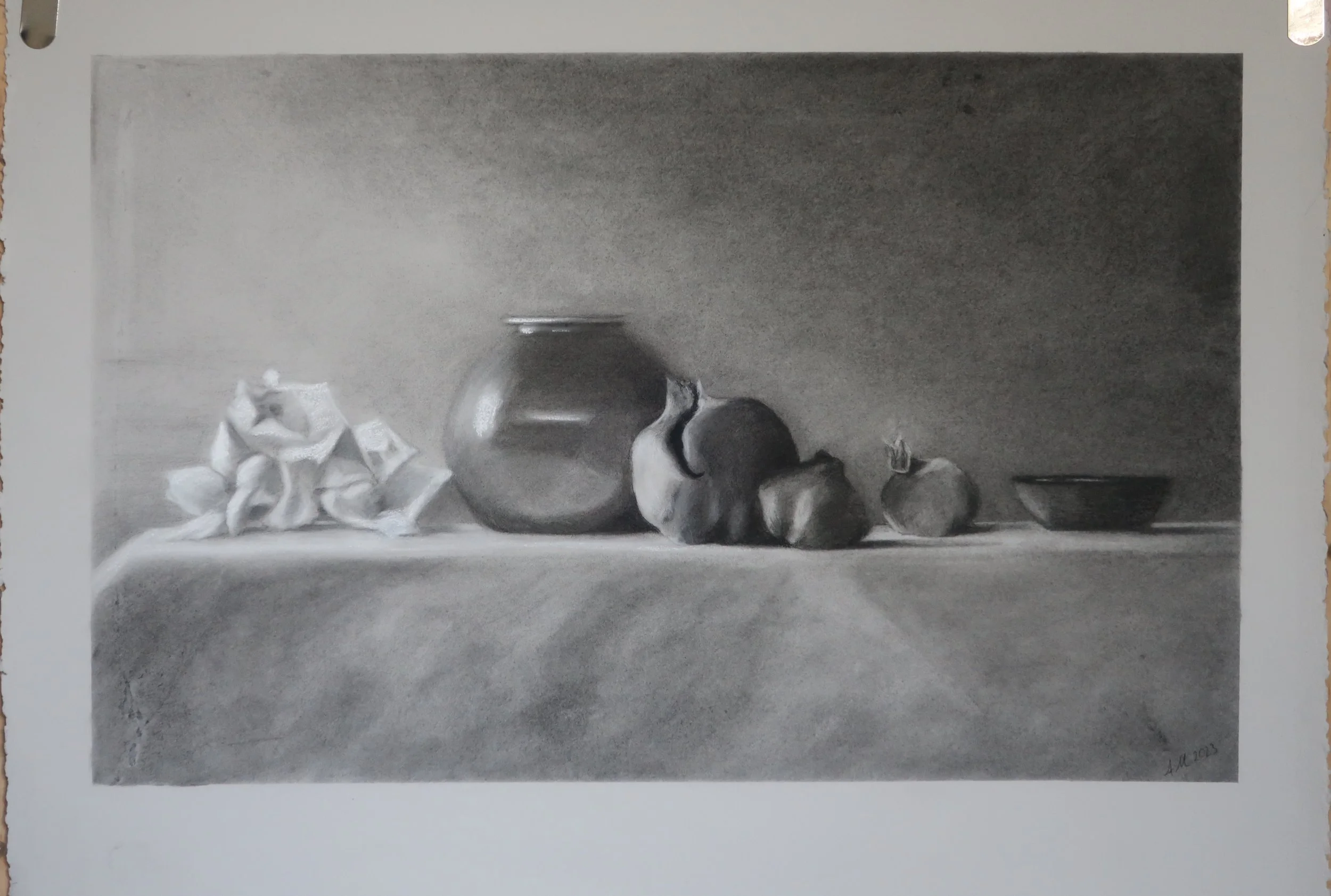
Annette M.
“For this still life, I wanted to create a feeling of the nostalgia we feel at the end of autumn, when the colorful leaves have all fallen and in this case, my pomegranates had dried and shrivelled!
I added in some lovely flowers to offset all the brown round forms. But the pomegranates should be the stars of the show.
For materials I used willow and nitram charcoal, pencil charcoal with white pastel added at the end. The paper is a steel blue Stonehenge, that was a little more fibrous than Im used to. It was a bit less forgiving of the tape and erasing and as such I have some marks I could not remove so tried to make them part of the image! To move the charcoal I used bristle brushes and other blending supplies such as cotton wool buds, make up sponges, chamois, erasers…..etc. “
-
![]()
Roger M.
“First time using this set of pencils and didn't turn out the way i had hoped ran out of tooth. Even though it looks like there is tooth available. Paper Strathmore Bristol 300 vellum. I used Faber Castell Polychromos with zest it.”
-
![]()
Movita M.
“Autumn Bounty - Assignment 2
Step 1: Choosing the Subject
For this assignment I decided to showcase the banana - a humble fruit, in a way that would convey abundance.
Step 2: Research
Several native varieties of banana are found in India – different sizes, colours, and flavour profiles and it is not just the fruit but the whole banana tree that is put to use.
The soft-fibrous outer layer of the trunk peels-off into strands that make excellent twine which is used for stringing garlands. The banana tree trunk can be cooked after peeling it down to its white cylindrical core – the banana stem. The banana flower is edible too.
Last but not least, the banana leaf is used as a plate to serve food (it get’s tricky with curry sometimes trickling off, but food tastes better on a banana leaf!). Here’ an image of breakfast being served to guests at a wedding on a banana leaf.
This still-life tries to shine light on the fruit.
Step 3: Setting-up the Still Life: Lighting and Placing the Objects
Used a small, single, warm light source in a dark room.
I tried several arrangements of objects and was not satisfied, until I placed a leaf diagonally and then suddenly every set-up with that diagonal leaf in the background looked nice. The strong directional effect of the diagonal appealed to me.
Most of the photographs I took ended up being top-view and there were many foreshortened objects.
Reference Photo Selected
Step 4: Selecting Size of Paper, Medium
Surface: A2 size. White. Medium Grains.
Medium: charcoal. Pencils and Powder.
Other tools: Brush, Make up sponge to lay down charcoal. Chamois, Kneaded Eraser, Tombow 2.3 mm round for reductive drawing.
Palette & Sponge: Sprinkled some Charcoal Power on a piece of paper and used that paper almost like a palette for using the charcoal powder and Getting Different Values with the sponge.
Step 5: Drawing (Time: 12 hrs over 3 days)
Used a photo reference and divided that into quarters. And also drew faint grid line on my paper.
Then followed Renae’s steps in FODAP too for under-drawing. Enveloping. Straight Lines to get basic shapes. Measurements and Proportions.
Step 6: Feedback on Drawing
Received feedback from NMA alumni and classmates re: diagonal of the lead leading the eye out of the picture frame. Ellipse of the candle.
Step 6: Laying in Values (4 hrs – 1 day)
The colours were hard to translate into grayscale on the fly. Ultimately used a black and white filter *glennbonk*
Lost most of the details of the under drawing.
It was a cyclical process of putting in value and pulling back. Using a mix of tools! This process was incredibly enjoyable! The charcoal powder gives a really dark 100% black and is hard to control.
Step 7: Details (3 days – Day 1: Leaf, Candle, Yellow Bananas; Day 2: Horizontal Leaf, Green and Red Bananas, Day 3: Banana Flower and Plates)
Stopped tracking time and enjoyed working on the details.
Step 8: Feedback
Took my WIP to feedback to Coach Catherine and to Willow House Alumni. Based on feedback I was able to make the candle, leaf and yellow bananas the focal point.
Feedback Takeaways:
Drawing: Not necessary to draw each object, each banana.
Values: Think of values in terms of explanation of form and forms in space. Don’t get lost in translating the photo.
Loose details of objects that are not the focal point.
Amp up contrast and details of focal point.
Design light side and shadows to (a) move the eye and (b) to emphasize focal point.
Step 9: Finishing Touches, Photographing the Finished Work, Submitting the Assignment
Finishing Touches took me 1 day!
Photo: I tried taking pictures outside, inside, different times of the day, but the values and contrast in none of the images resembles the contrast in real life.
Submission: Preparing this ‘process note’ took me 2 hours. But this retrospective investigation of the process is already helping me digest my learnings better and in understanding my current strengths and weaknesses better.
Time Taken: Two weeks
Start Date: 26 October 2023
Finish Date: 09 November 2023
-
![]()
Evynne C.
Recipe for Roasted Tomato and Sweet Potato Soup
Graphite on A2 drawing paper
“My partner laughs every time he sees a this months-old kumara because the sprouts have grown comically long over time (about half a meter in length). For this still life, I snipped off the super long & floppy sprouts and combined it with truss tomatoes, garlic, and cooking wine posed against my demin apron. The still-life is lit with a portable desk lamp.
During the drawing process I applied many concepts I learned at NMA this year. Composition and value thumbnails I learned from Bill Perkins' composition class, the rendering style I picked up from Iliya's FoOD course, and my treatment of light and shadow is based off my learnings from Renae's FoDaP class.
Regrettably I was unable to get A2-sized toned paper, but I wanted to work large since this is my first complex still life with traditional media. I think my still life was successful, but there are definitely many improvements for the next one.
Postscript: add a dash of salt, pepper, and basil for seasoning.”
-
![]()
Georgie S.
Charcoal pencils on toned tan paper
-
![]()
一天过一天 (Fiona)
“Throughout these few months since the assignment was sent out:
I improved exponentially in 3D drawing
Begun to understand values in value scale, which I could immediately apply
Learnt caveats of rushing and expecting tones of efficiency with myself
Found 2 mentors ( not in art), but learnt of their endurance and more. Without them, I might have stopped for a lot longer and have not much progress.
Learnt a bit more about painting and the coloured pencils I have
I found a way to keep focused in Study Hall though I sidetrack often - I play Deep Lofi Focus, or Claire Yuan Art on Youtube. I'm so glad she shared her channel, it's admirable.
It's a challenge, but studying lines based on Alphonso Dunn Pen and Ink helped me with the scarf on the candle holder technique
I began to be more observant of composition and where things are positioned.
Having done the assignment twice, they seem of completely different worlds. I would say that I would need to plan real life setup better, but I come up with a better understanding of my shortcomings. I learnt somewhere about being stuck that it is also good, as it helps you know where you can improve.
But I am glad that I decided to make a change and try something else. The first round taught me composition to some extent, the second, values. I have also been catching up on group coaching recordings (though I skipped a week) and I learnt a bit about tangents and other things that further impacted my drawing adventures directly or indirectly here.
I noticed as well, that I keep saying, 'We got this!' and I met more people, we study together in study Hall. and I kind of check in at times on how are things. I also went looking around for motivation and found some, which led to some quick writing sessions.”
-
![]()
Volha R.
Digital Artwork
-
![]()
Tom F.
“I did exactly what was outlined in this class: NMA LIVE CLASS
First I set up my still life and did some composition thumbnails. Then I did a full sized graphite drawing of it. Following that, I transferred my graphite drawing onto a new sheet with ink and a lightbox. After that, I did a color study in watercolor. Using the ink copy of my initial drawing, I then lightly traced it onto my final watercolor paper in graphite, stretched the paper, and began to work in watercolor, starting with just basic initial colors.I continued to work on each subject in my still life one by one, gradually layering watercolors and building up detail. I tend to work one object at a time rather than working on the whole piece at once, so I wind up with an extremely detailed gourd while the rest might be just a basic color.
I deviated from Miles' course somewhat in that I chose not to use a layer of gouache at the end, as I wanted this to be a pure watercolor piece. It was a challenging assignment, but it gave me the confidence to say that I'm pretty decent at watercolor.
An unexpected issue that I ran into is my gourds all started to rot at various points. I thought gourds typically had a decent shelf life, but that didn't appear to be the case. Initially I worked from real life, but as each gourd became moldy, I found myself relying increasingly on the photos I had taken.”
-
![]()
Dominique C.
“I started with some studies to understand the shapes and relationships between each object, as well as their values (I'm sharing this study as well although I apologise for the quality of this picture as the paper got wet). I then started the piece by drawing very lightly the various objects. I then built up the values very slowly, starting initially with the darkest areas.”
-
![]()
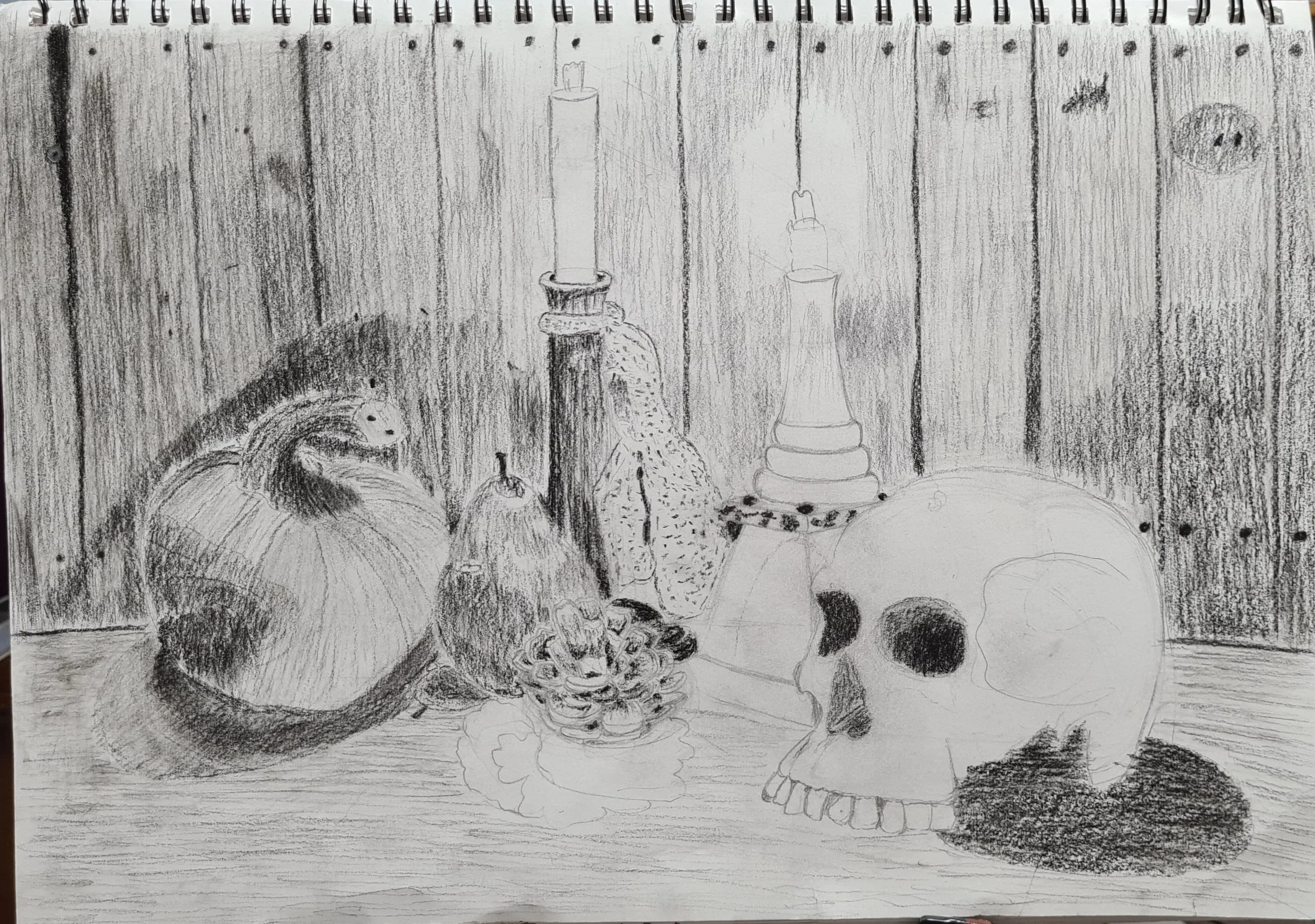
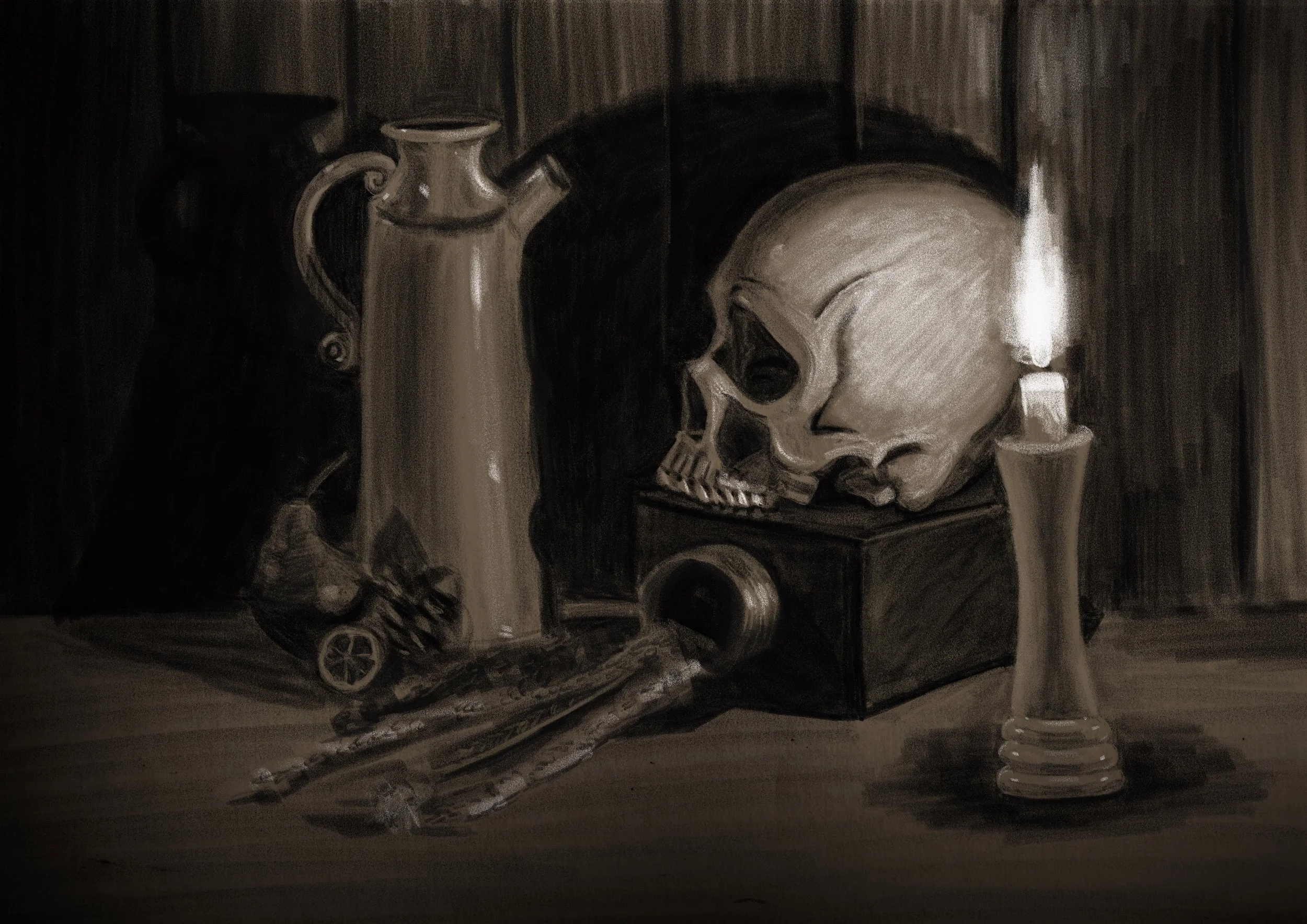
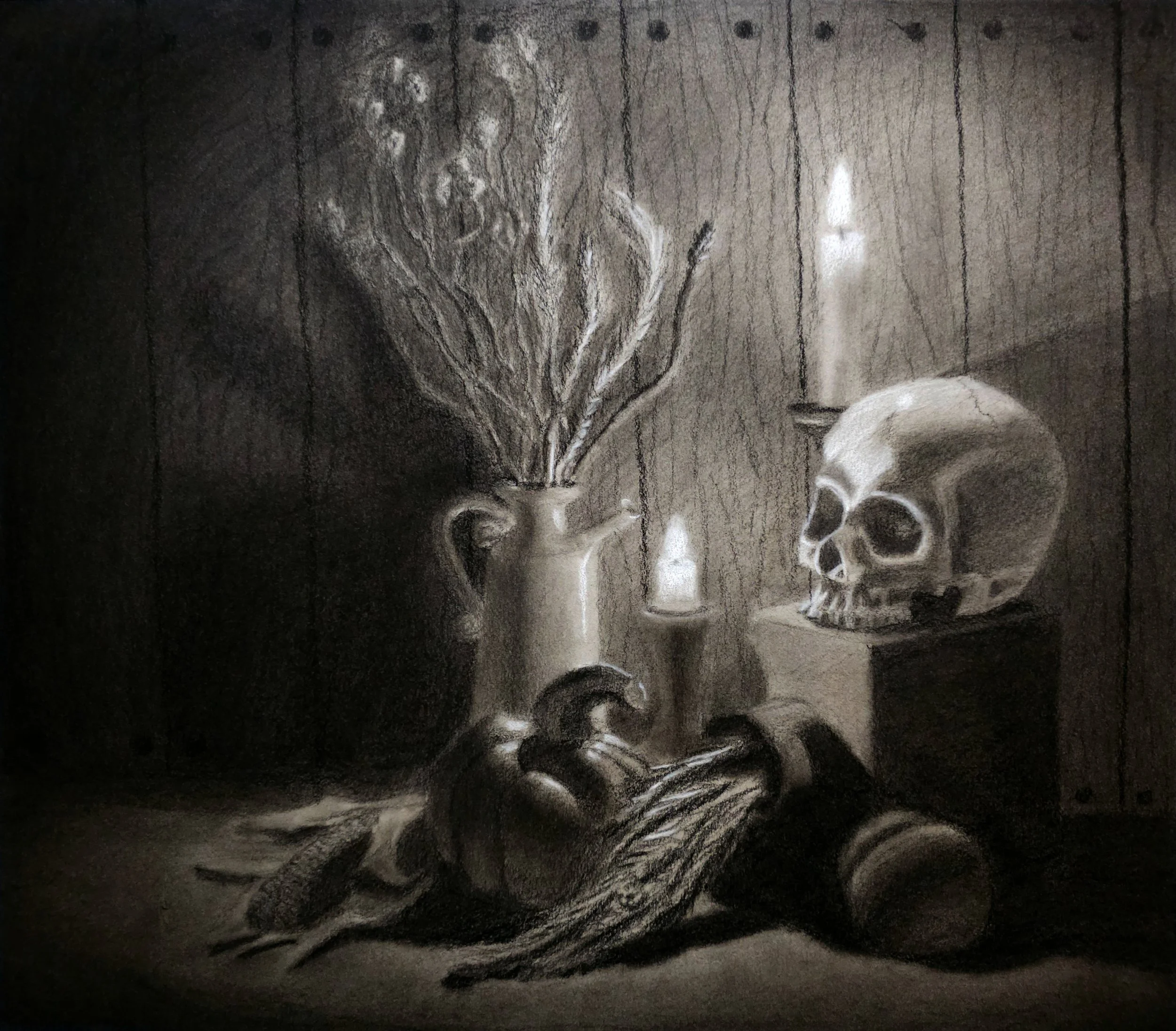
Celeste N.
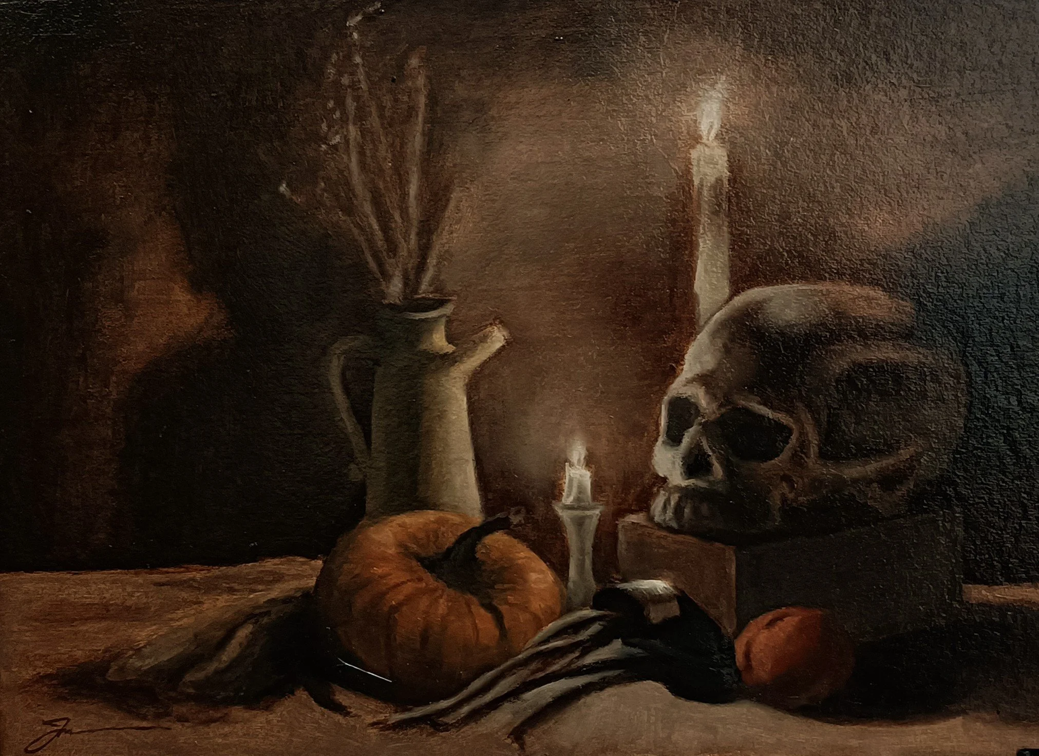
“I started using charcoal on toned paper but I realized I’m not going to be able to carve much time until the deadline so I switched to digital. I took a picture of my initial sketch and used it as the base layer for my digital drawing. I tried to keep it as traditional as possible: I used one single layer, one single charcoal brush (only used 2 different sizes) and I didn’t use any selection/resizing tool. At the end of the process I added a bit of black blur in the corners to make the piece look moodier. The skull is the element with most detail and contrast because I wanted it to be the main subject of still life. I used a reference from NMA.”
-
![]()
Brenda G.
“Mainly used charcoal. I got the itch to bring in some colors and decided to use a set of colored charcoal I had. It was an experiment to add the colors and made the project a bit more interesting.”
-
![]()
Paulina R.
“I gathered many objects I liked, and for a couple of days, I played with them, rearranging and trying different setups until I found a composition that genuinely inspired me. I used Pitt Pastel pencils on the gray paper. After linear block-in and massing shadow shapes (burnt umber and black pencil), I used a white pencil for light areas. Later, I decided to add the color but limited my choices to a couple of pencils (ochre, terracotta, sanguine, sap green).”
-
![]()
Jaylene S.
“I have recently moved so I didn't have a good place set up yet for a good still life, so I used one of the NMA references provided. I simplified the reference a bit. I chose toned paper thinking to do a charcoal, white pastel drawing. Then I changed my mind and used full color chalk pastels. “
-
![]()
Erica C.
“Single Color in watercolour. This is to practice layering in watercolour. This is an exercise from a watercolour book.”
-
![]()
Aimee M.
“I set up my own still life with pomegranate, apple and pumpkin for the harvest we see in fall, as well as deer skull and antler to represent the thinning of the herd before winter.
I used pan pastels in a range of greys applied with a Sofft palette knife to a 12x16 sheet of Canson Mi-Teintes paper. The final work is 11x14.”
-
![]()
Jeremiah M.
“Oils on strawboard panel. I first stained the base with a mix of raw umber + burnt umber, and then wiped out the basic shapes using an old rug to get the approximate placement of the shapes. Then did a monochrome layer using the same mix, and refined it on a second layer to lock in the values. Once that was dry, I switched to colour on the jug (yellow ochre, raw umber and white), pumpkin (magenta, cad yellow deep hue, yellow ochre, burnt umber and ultramarine blue) and peach (same colours as pumpkin).
Picture of work depicts varnished version.
Value study (done separately) - mars black & tianium white
Oil painting on softboard panel, waterproofed with a acrylic house paint and then 2 coats of gesso (sanded down to make smooth)
Imprimatura - mix of raw & burned umber
Underpainting - mix of raw & burned umber using liquin
Colour layer - various colours (raw & burned umber), mars black, titanium white, yellow ochre, cadmium yellow, magenta, crimson.
-
![]()
Mayrena V.
“I decided to use one of the photos NMA provided.
I chose a photo with a few items.
I drew a few thumbnails to decide on the composition. I usually like space but in terms of composition I am aware it is a no, no.
I decided on my medium: Oils, mostly because I love their texture. I roughly sketched my composition on a 11x16 oil paper.
Once, I had my drawing I painted my shadows and them proceed to apply the rest of the tones: First the apple, then the yellow flower pot and when I got to the oddly shaped squash I struggled with its shape! Finally, I changed the colour so it looked more like a vegetable. I also added the two pieces of dry orange to add to the complexity of the composition and to make sure the viewer does not focus much on the squash and move back to the rest of the painting. I wanted to begin a new piece but I am a bit behind my schedule with other work so here it is.
Lastly, I painted the contents of the yellow vase. I think I could have done better with a bit more knowledge on how to go about this part, namely painting branches and dry flowers.
I wasn't sure on how to go about the light as it seems there are two sources of light.
Thank you for the challenge! It would be nice to get these type of challenges regularly.”
-
![]()
Elke A.
“I picked a picture I liked and used charcoal on steel grey paper.”
-
![]()
一天过一天 (Fiona)
I updated the process in the PDF, if I am to phrase it, I did a little research about autumn, and wanted colours.
-
![]()
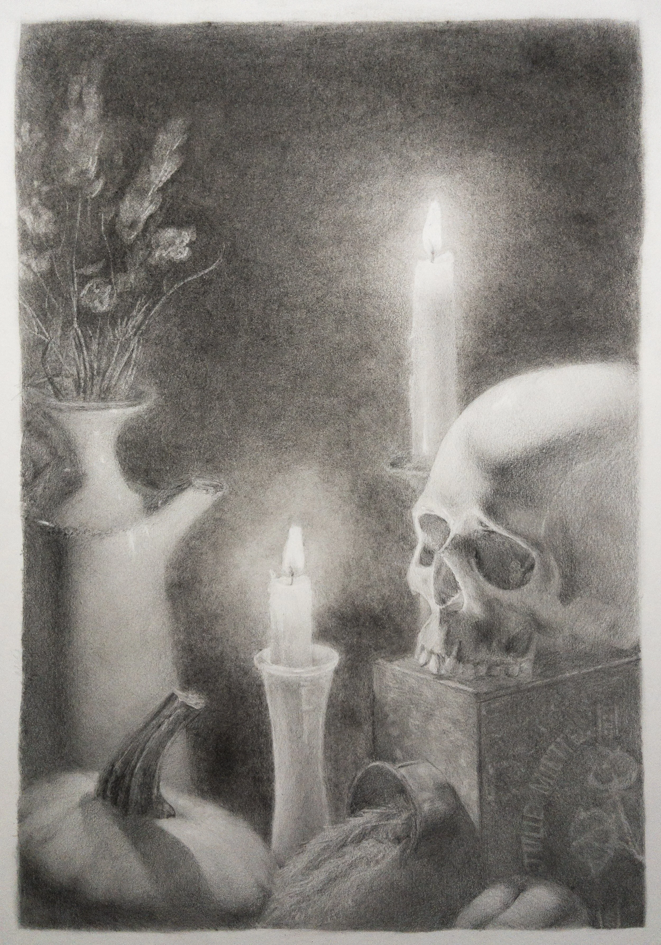
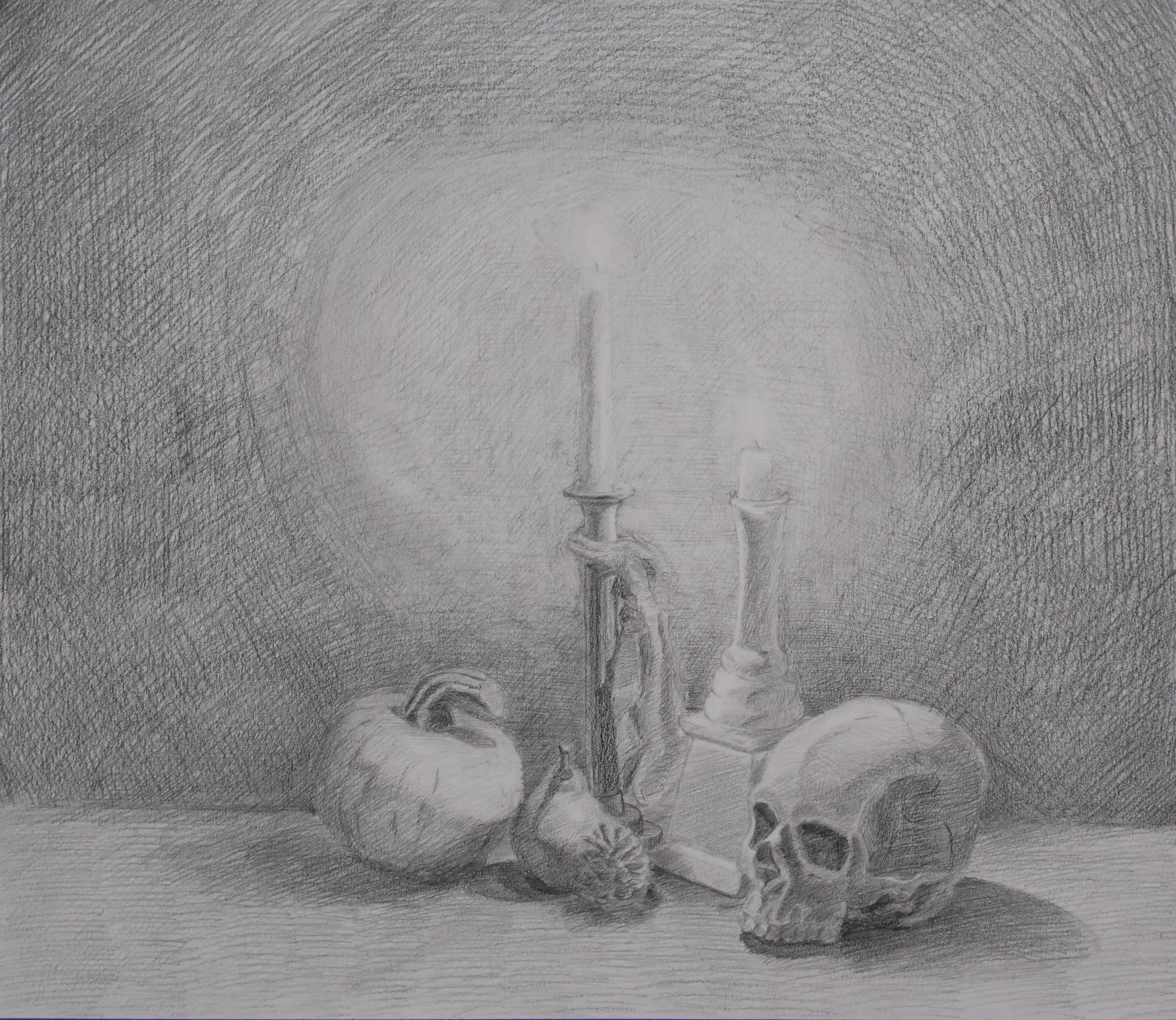
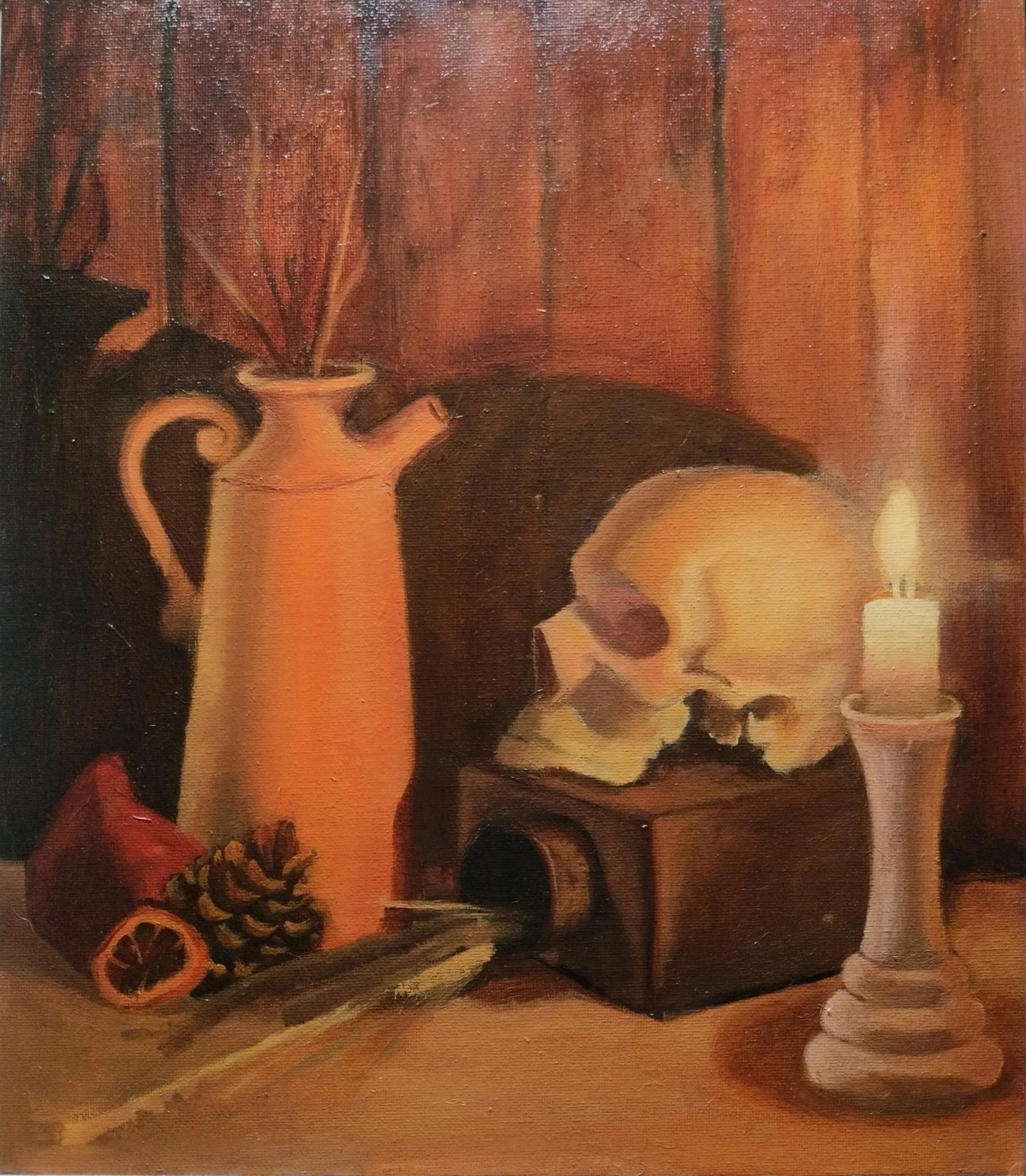
Julie M.
“I included a collage that shows my process. I started by sketching the photo references using the Master Mash prompts to familiarize myself with them and choose the one I would use for my final piece.
I then did thumbnails on post it with markers to select a composition. I sketched my final composition, making modifications from the original picture (the shape of the pitcher and the stem for example) for things to point towards my focal point, which I wanted to be the skull's face, and the central candle.
I took a picture of that sketch and manipulated it in Procreate to create a more elaborate value study than my thumbnails, and started drawing on my final A3 piece of paper.
I wanted the value of the background to be in first in order to have something to compare my elements to, I thought adding tone on a white background wouldn't be a good idea since this image is overall dark. For this I first tried using the side of graphite sticks, following the wood grain to get a bit of that texture, but the plastic coating of my sticks damaged the paper and I wasn't happy with the result.
I traced my drawing, transferred it to another paper and started over. The second time I used graphite powder applied with a cotton pad for the background, which gave a very different effect I preferred. I intended to add the wood texture later on with a fine eraser and pencils, but ended up preferring it as it is.
I have mixed feelings about the result, but I used a lot of what I have learned since enrolling at NMA in this piece, and my mother gave me her ultimate compliment: "I want it", which is a good sign.”
-
![]()
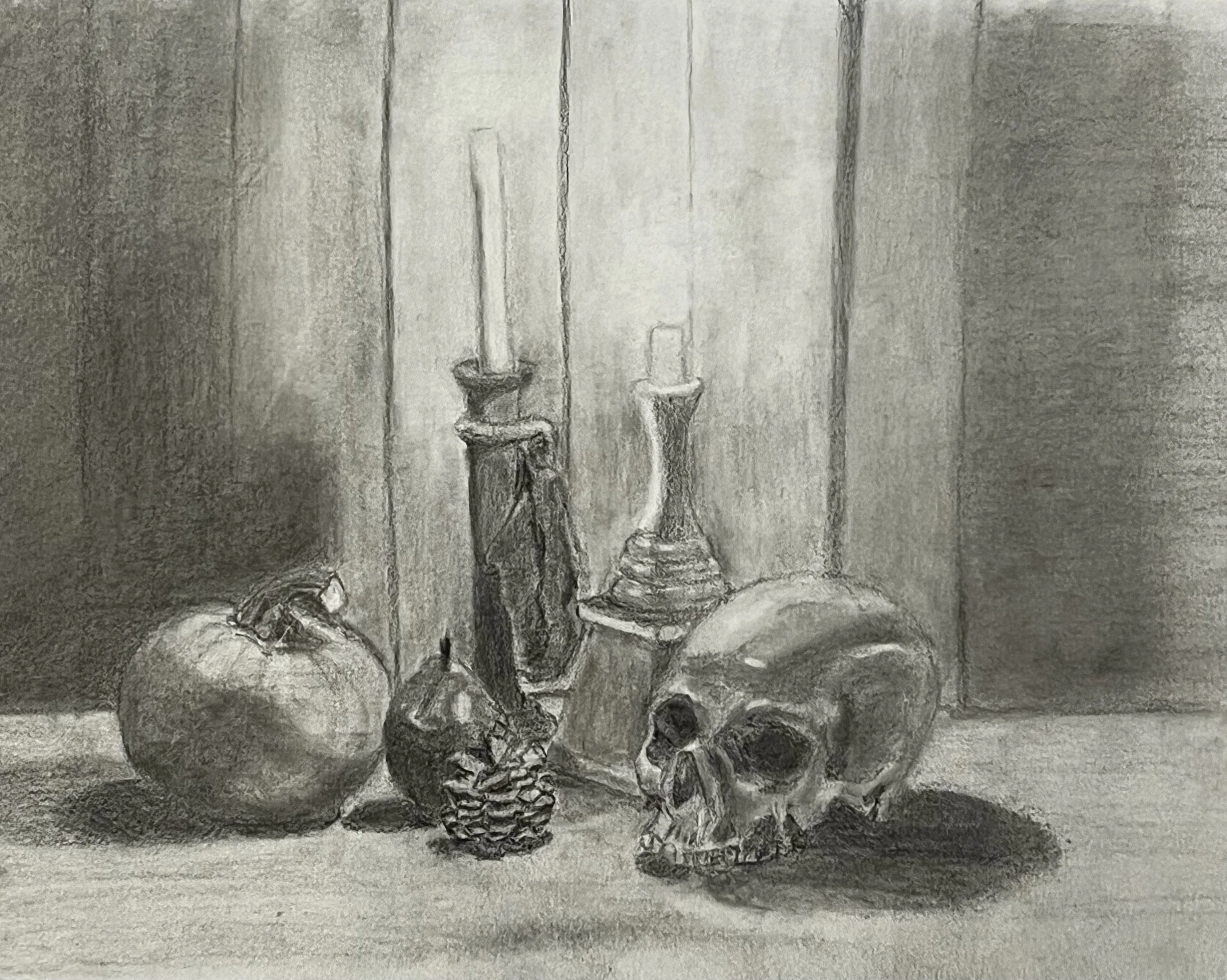
Dio B.
“I'm rather short on studio space so chose to use one of the provided photo references. I did a few thumbnails, and cropped the photo to adjust the composition. I did a rough lay in with graphite, then meticuously tidied it up with a grey pen. Worked over that with watercolour, but it wasn't behaving like I expected and I made a lot of mistakes. After a few hours I cut my losses and switched to coloured pecils, working over the top and did my best to salvage my dog's breakfast. When I took the tape off I realized I'd been working on the back of the paper the whole time, which explains some of the issues I had experienced. Not my proudest moment, but hopefully a learning experience.”
-
![]()
Anu R.
“I did my drawing on grey paper using charcoal pencils.”
-
![]()
Czerina J.
Oil on canvas 18x14
Took the photo outside in the afternoon to avoid glare. Had to compress file size for uploading.
Did the drawing first in graphite and sprayed with fixative.
Started with an underpainting of Golden Fluids Nickel Azo Yellow and Quinacridone Nickel Azo Gold.
Checked on my drawing to get the values. At this stage, I did a bit of experimenting with the underpainting using Holbein Oil Quinacridone Opera for the dark values.
A bit scary at this stage to achieve the autumn glow. Right now I can't recall what oil paint I used for most of the underpainting aside from the Quinacridone Opera.
Then I washed it with Transparent Red Oxide and Alizarin Crimson and rubbed all the areas with Gamsol to get the highlights. I already have an album swatch of oil palette for reference. Really helped having done that exercise.
I used Cadmium Yellow, Cad Yellow Deep, Cad Orange, Yellow Ochre, Cad Red, Alizarin Crimson, Viridian, Ultramarine Blue, Cobalt Blue with Transparent Red Oxide as the prominent color. Then glazed with Indian yellow to achieve the glow. This is quite a scary project for me and took a lot of thinking. Really challenging! I can't remember how long was the painting time, quite long 😅
Classes that helped me with this project was Renae Wang's Figure in Environment and Fundamentals of Drawing and Perspective. She had exercises on pumpkins and painting a sphere in oil. Catherine Bobkowski's Oil Painting Master Copies Part 1 and Charcoal Master Copies.
Drawing in charcoal helped in learning the nuances of values, painting in grayscale etc... All in all this is a great assignment. I'm grateful for the learning process!
-
![]()
Michael G.
“After I had chosen the image I wanted to use as a reference I cropped it a bit to my liking and so that it better matched the size of my paper. As a my main medium I used Conté à Paris Pierre Noire pencils. As I intended to also add some highlights with white charcoal I decided on toned Strathmore paper so that the highlights would have more pop.
I then blocked in the overall shapes for which I was using some graphite pencils. After that I switched to the Conté pencils and added the main shadow shapes. From there I added more and more tonal values continuously adjusting elements where I found that I had botched the measurements or the shapes a bit. After I was satisfied with the overall image (which took a loooong time) I added the white charcoal as my last step.”
-
![]()
Ruchi S.
“Composing the still life, made some thumbnails out of it, and then created an original pencil sketch, and then started creating illusion with charcoal pencil, and graphite pencil on cartridge paper!”
-
![]()
Thomas T.
“
I started with looking at the reference pictures from NMA and do some sketches with my pencil. After that I took a picture and drew and edited the sketch in Photoshop and made a value sketch over my drawing. With the final sketch, value sketch and the reference pictures I painted the pastel painting on a Sennelier pastel card by 12"x15" with my soft pastels and pastel pencils.”
-
![]()
Joanna Z.
“I have used oil paints on the canvas from a block. I painted in two sittings, based on the reference provided by the NMA.”
-
![]()
Christopher L.
“I created my still-life as a contour drawing because that's as far as I've gotten in FoDaP. I used one of the provided photographs of gourds and fruit as the basis of my drawing, then I drew them digitally in Krita on my computer. I wanted to use digital media for greater ease of correcting mistakes (because I am still very new to contour drawing) and because I don't have any grey tonal paper. I believe it turned out fairly well!”
-
![]()
Ross C.
“Scorching wildfires leave behind a trail of destruction as you drive down the 103. Bare land covered in ash and blackened spikes where thick forests once stood. Floods follow, washing out roads, ripping power from the hands of small remote communitiesNeighbors evacuated. People grab what they can. They wander like nomads trying to find family and their next meal while they wait to return to where their home was. There was little to begin with, and no capacity to rebuild. It's just inflation, they say. Autumn paints what was spared in vibrant hues, but offers no harvest, only a biting cold. This still life captures the frantic struggle to remove water from a flooded basement before the foundation is destroyed and mold devours the house.” 36” x 24”
-
![]()
Eslem A.
1. Work in the general composition with lines.
2. In a multiply layer I work on the shadows and rendering
3. In another layer I set the flat color of the objects.
4. Work in the direct lights of the candles
5. Work in the rendering and reflected light.
6. Details and texture.
-
![]()
Susan R.
“I set up my own still life, as I wanted to use the thumbnails for both Week 7 and this assignment. This is a 16x20 done in oils which starts with sketching in your shapes and then massing in and refining. Thanks to Marian for her critique, I struggled with the ellipse on the pitcher as I kept drawing the ellipse straight instead of the angle. As soon as she pointed it out is was duh! Looking forward to the next assignment.”
-
![]()
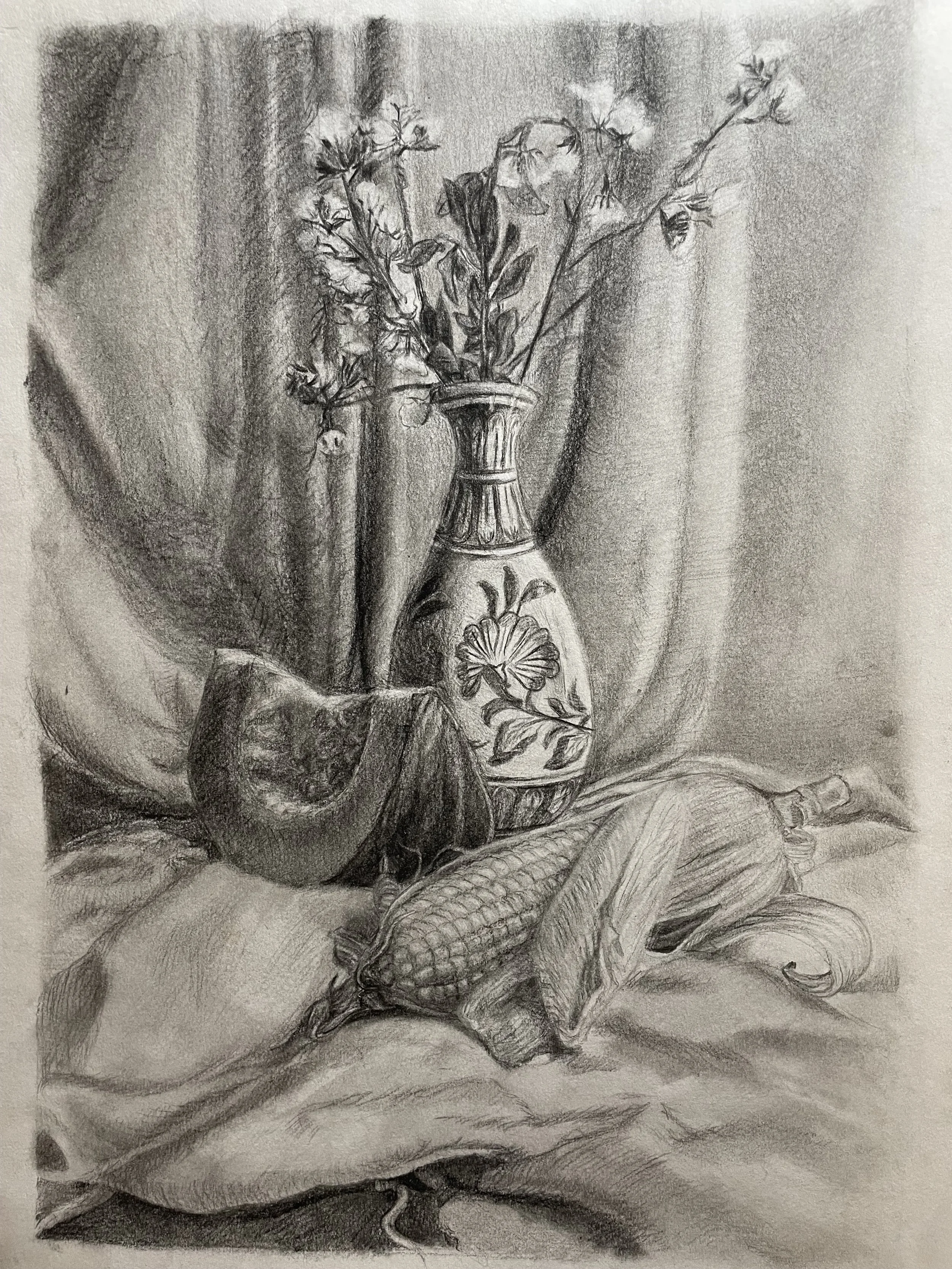
Chris D.
“Due to a deadline for a job and travels, I had to do this assignment partly on the road and partly at home. I had picked apples some days before we left, selected three of them for my still life, and took them with me in a little bowl in the footwell of the car.
We stayed in various places during our trip, always just for a short time. I set up still lives in all the places we staid in and made sketches, but wasn't content. One morning, just before we left, there was some sunlight right behind the little oven in our apartment. I loved the light and the strong shadows and just put my bowl with apples there. I liked how the darks of the shadows crept into the freshness of the fruit, and how the shapes of the apples, the bowl, and the shadow of the bowl connected with the pattern of the tiles on the floor. I took pictures and made sketches.
Back home, I made thumbnails, some chiaroscuro, some notan, and some with shadows. Looking at the thumbnails, I decided to go for a square format. As I had so little time left, I first made a charcoal drawing in the reductive method Catherine taught in her Charcoal Master copies live class. I wanted to have the drawing first to be able to submit something even when the oil painting was going to be messed up :)
Then I started the oil painting. I wanted to work with oils because I loved the contrasts of the reds of the apples and the blues of the floor, but also because I've felt mixing and using darks is one of my weaknesses with oils. I built the frame, stretched the canvas, and primed it. For an autumnal feel, I added a warm, orangey foundation mixed from light ochre, English red, and a hint of ultramarine blue to take it down a little. I used both my charcoal drawing and the photo as a references. It was so challenging - too challenging in many ways. I think I didn't handle the darks very well. The lighting conditions were too difficult for me. I tried to focus on the rhythms and the connections between the shapes and colors.
I had a clear plan about how I wanted the eye to be led around into the painting from the shape of the twig's shadow to the twig then to the apples on the right, the leaves, to the apple on the left, then round and round again. I think it hasn't really worked out, though.”
-
![]()
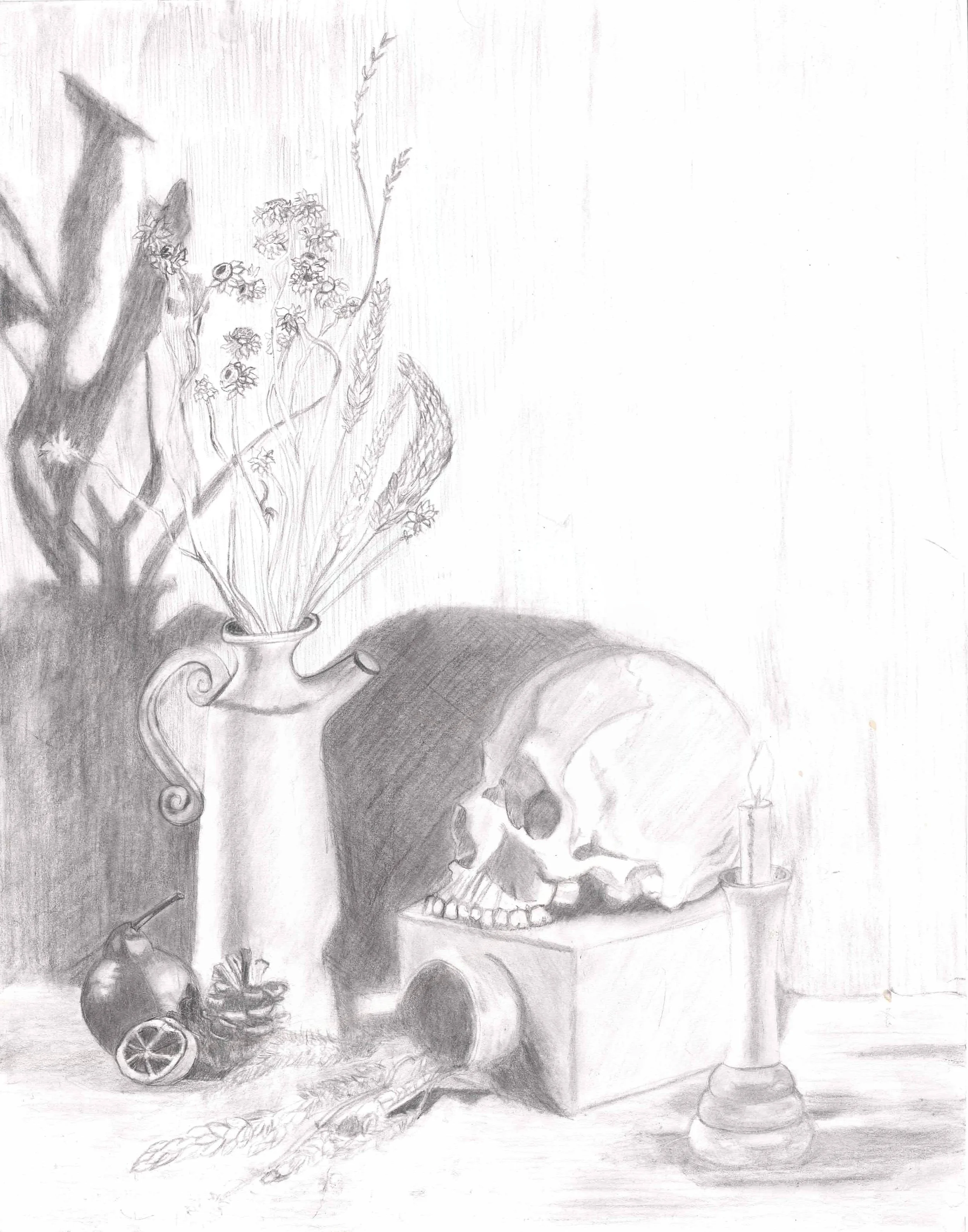
Benedict M.
“I tried to first find something that i resonate with, i like skulls and i have never drawn an animal skull before. I pretty much spent most of the time drawing the Skull in Proportion and trying to understand it. Then i worked it like any regular Charcoal piece.”
-
![]()
Michael D.
“I started with some simple shapes to get the general composition down. Then refined the shapes to look more look the items I was trying to capture.
Once I was satisfied with the lines I experimented with some different mediums like charcoal and graphite to see where I wanted to go. After some experimenting I settled with hatching.
Then it was just a matter of refining the shadow shapes, tweaking the contrast, and just having fun experimenting with the hatching.”
-
![]()
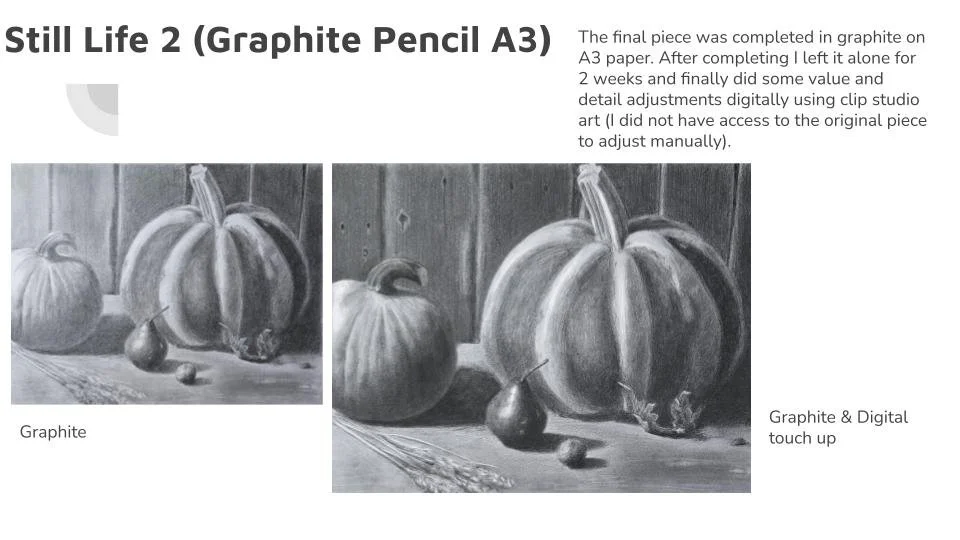
Aoife B.
“For my first go at the assignment I did value studies in both graphite and gouache and decided to do the final piece in gouache.
The first final piece was A3 in size and I struggled using gouache at the size. I learned a lot during the process but ultimately wasn’t 100% with the final piece so decided to do another one in graphite.
For the second attempt, I chose a different reference photograph and did a number of thumbnails. I then did a number of studies including value studies in graphite and gouache and texture studies in graphite.
The final piece was completed in graphite on A3 paper. After completing I left it alone for 2 weeks and finally did some value and detail adjustments digitally using clip studio art (I did not have access to the original piece to adjust manually).”
Summary of learning:
Experience in reference image selection, thumbnailing and value studies
Experience in painting gouache on a larger scale than previously
Experience in lay-in, values and refinement
Experience in using digital tool to do final touch ups to image
-
![]()
Krystal Y.
“I decided that since overall, I would like to be a painter, and even as a possible children's book Illustrator I would like to do a lot of the work in paintings, so I chose to try this first assignment in paint. I am curious to see how I grow overall as an artist in this program.
This piece was a major labor of love. It went through many stages and I took almost the entire time to complete it, which is different from how I engage with coursework, or had to engage with coursework in my in- person classes. While I appreciate learning to be quick, this process was really freeing, to have more time to engage with a larger body of work. I think this is a clue for me to use this process as an artist for personal work versus commissioned or contracted work. “
Acrylic on Canvas, 18"x24", Autumn Harvest Assignment 2023
-
![]()
Phoebe T.
“Still life set up and lit with candles and one fill light on the left side. Painted in oil on canvas.”
-
![]()
Patrick J.
“Hi! This is graphite pencil, mostly 2B, on Strathmore 400 paper, cold-press. I used the smoother side, but next time I will probably use a hot-press paper.
That said, I really enjoyed making this. Total time was about 12 hours over 4 days. I did leave it a little to the last minute. The only real problem with that, and the rough paper, is that the background is a bit more mottled than I was aiming for.
I was inspired by Spanish still lifes like those by Juan Sánchez Cotán, with their dramatic lighting on dark backgrounds. I love how those focus so intensely on everyday objects. It also felt interesting to me to try and tie different shapes and textures together in a single piece and to try to find a unified composition, but without anything touching.
Great assignment. Thank you!”
-
![]()
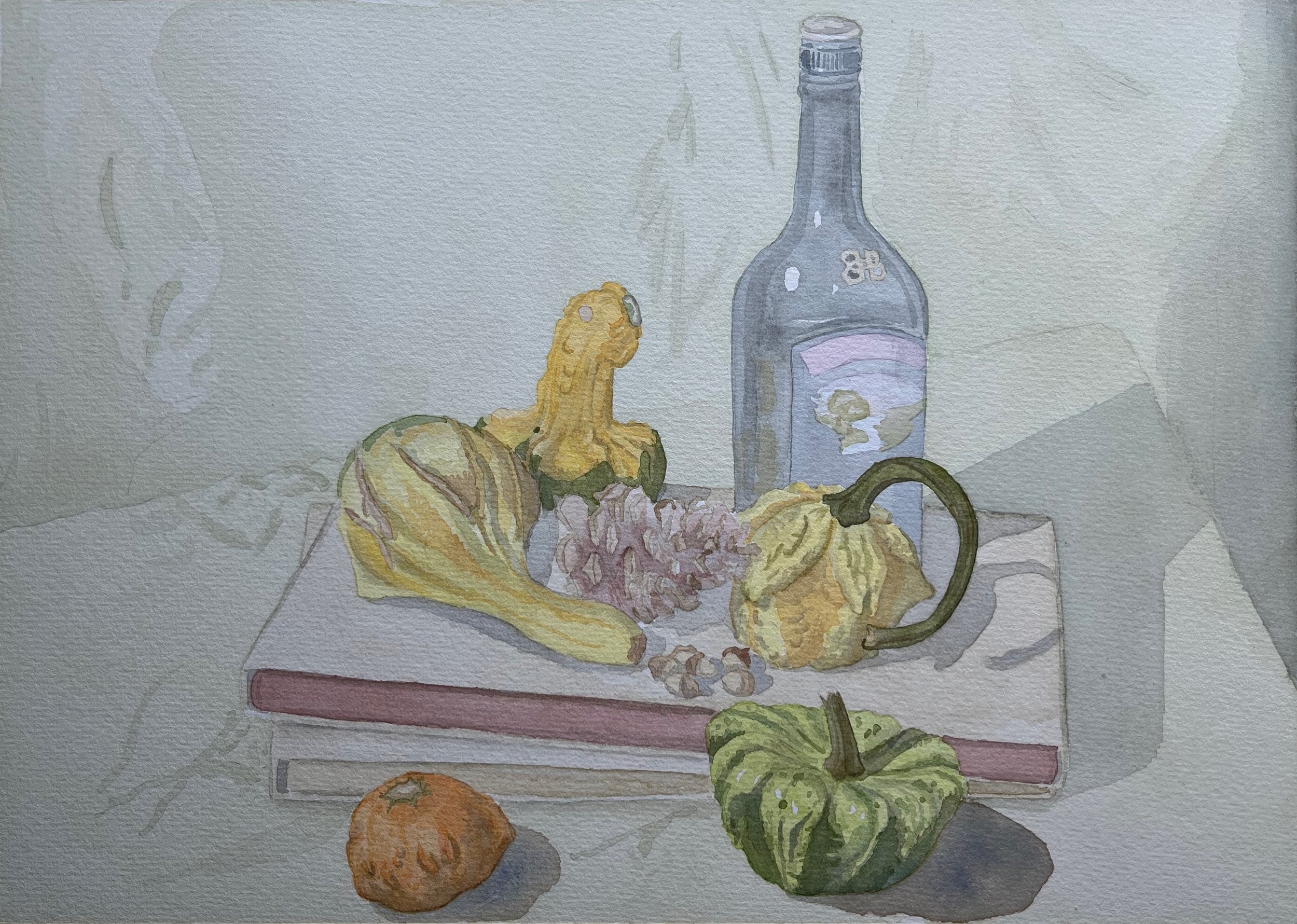
Issa D.
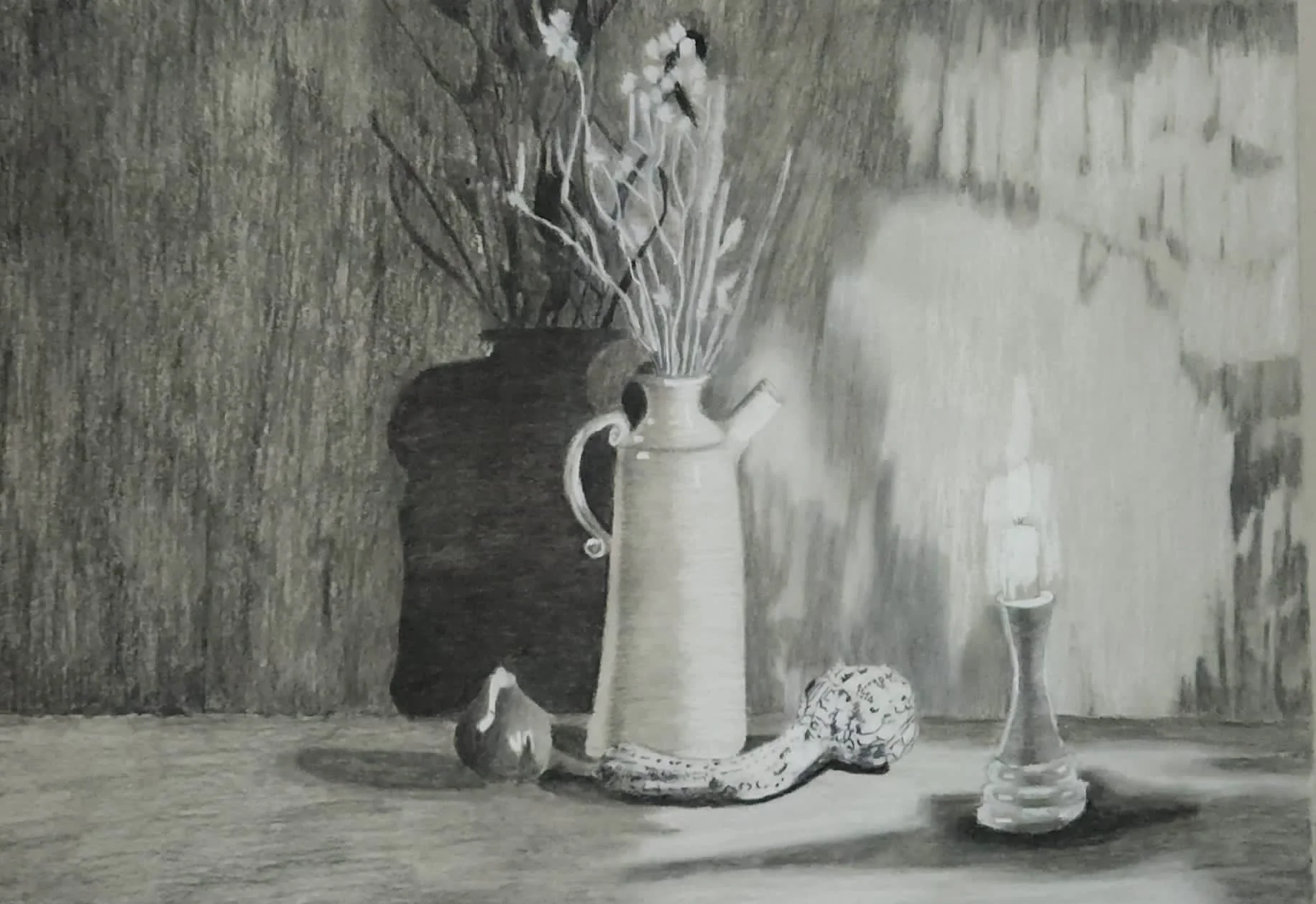
“This is not completely done yet. I knew I wanted to this assignment in oil paints, so I started by studying the values and deciding on the composition that I want to do. I did a graphite study before starting the painting. It has been a couple of layers. I kept trying to get the right temperature and color. I think this is the closest that I get to the mood that I was going for. I really wanna close in on the elements here to give a very intimate feel at the subjects. I wanted to focus on the skull and vase, but I'm still trying to workout the details on it.“
-
![]()
Denis S.
“Worked on it over a few weeks using graphite pencil (4B)
Changed when i heard Bill's critique (another student's, but with the same image)
and Marian's (critique) I changed the composition a little.”
-
![]()
Basil W.
“I used Pitt graphite matte pencils 2b, 4b, 12b on 11x14 Strathmore Sketch paper”
-
![]()
Hilary S.
“This was such a fun painting to do! I knew I wanted to use oil paint because that is my current favorite medium. I set up my props on a shelf and spent hours moving them around until I found a composition that spoke to me. I did one value study in charcoal and one value study in monochrome oil.
I remembered that in Catherine's Still Life with Oils class, we spent one week painting a blue pitcher that has a similar look and feel to the small vase in my still life. So I rewatched that lesson to get a refresher on the brush technique, which was very helpful.
I started this painting in early October, and finished my first draft by October 15. I had to focus on other things for a few weeks, and in that time my pumpkin rotted so I had to go off of the photo for my second draft. Bill and Marian both gave me great feedback on my draft, especially about my edges (when to soften and when to sharpen).
When I came back to do my second pass, my painting was dry. I remembered Catherine saying that you could put linseed oil on the painting when that happens, but I think I put too much on my painting. It was kind of tacky or gummy when I painted my second layer. In some places I think that gave it a good texture.
I'm so glad I was able to get great feedback from Marian on how to improve my painting. I'm really proud of how it turned out. Thank you for assigning this fun project!”
-
![]()
Giang N.
“I've decided to do this Harvest Still Life in graphite with the main goal of applying the lessons learnt in Drawing Foundation I and Fundamentals of Drawing and Perspective (up to lesson 6).
Once I chose the photo, I created a few thumbnails to figure out the Design Matrix through completing a two and three-value studies.
Once satisfied, I moved on to drawing the main lay in. I started with creating an envelope for all the elements of the composition. I then sketched in all the items while working on maintaining the right proportion and placements of the elements (through the use of direct angle transfer, measuring, use of plumb lines etc.)
I drew in the shadow shapes and filled them in so that I arrived at a two-value matrix. After that it was a matter of expanding on it, starting from the darkest darks and adjusting the value as I went.
While I realize I could have pushed the values more, I like the medium high key of the final piece.”
-
![]()
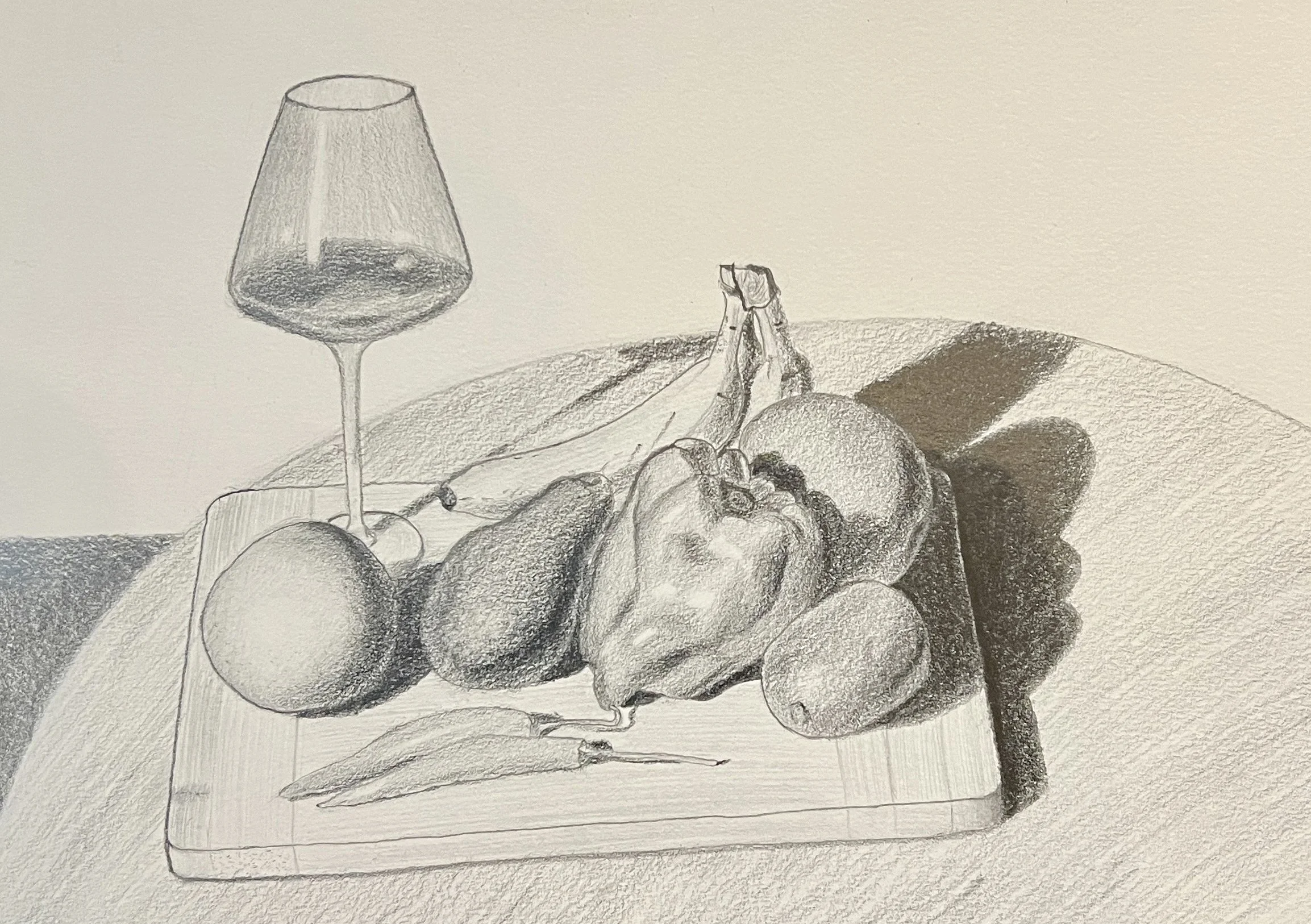
Andrew W.
“I bought a few veges from the local fruit shop and arranged them on a cutting board to make my still life! It felt like it needed something else, so a wine glass was the perfect addition. In future, I'd like to be able to get a more 3D shape on the glass so it looks more in line with the rest, and has a more believable texture.
I took what I learned from Fundamentals of Observational Drawing and applied those principles of light. I particularly like how the capsicum turned out, and I picked that particular one because it had such an interesting shape.
I'm really enjoying some of these new skills and can't wait to learn even more!”
-
![]()
Wei Wei
“First few passes in graphite pencils, then photographed and edited in Procreate for final submission.”
-
![]()
Josseline J.
“This artwork was created with oil paints on wood. I began with an underdrawing using paint, and left the wood as the ground tone. I applied a light wash for the grass and thin layer of paint for the rest of the piece. I began with focusing on establishing the local colours, generalising the colour of each object and maintaining the shapes made in the drawing stage. From there, I began building the paint to create the form, going back and forth with adjusting the values and colour temperatures. I focused on maintaining the quality of light in the park, on a bright and sunny spring day, where the light was more diffuse to avoid too harsh of contrasts and shadows. The piece was inspired by Pierre Bonnard's landscapes and Giorgio Morandi's still life. I wished to capture the beauty of spring here in Australia. The addition of the feather and pieces of bark were from me finding them at the park where this still life was created.”
-
![]()
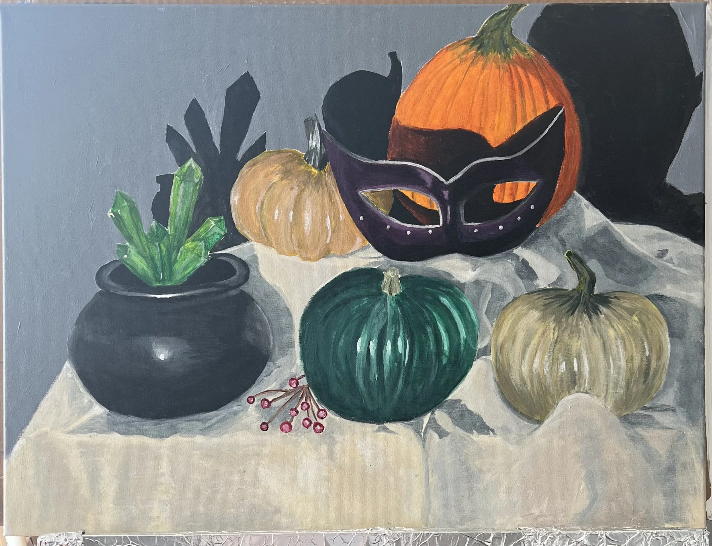
Natasha N.
“Thanks to Marian, I got to ruminating about life changes along, the quickly approaching Halloween season, and the success of the Barbie movie. I began toying with the idea of blending the Headless Horseman (a story that terrified me as a child) with Barbie and a bit of "harvesting.”
I started with a several thumbnails mostly exploring different background colors. I leaned into the graphic and overly-vivid nature of the doll. I wanted bright colors while hinting at a menacing or unnerving feeling.
It was painted in three stages. Toned underlayer (burnt sienna). A block-in. Then refinement.”
"Harvest", 11x14, oil on canvas board
-
![]()
Nathan B.
“For the final piece I used vine charcoal on Mi-Teintes Canson paper.
Before the final piece I explored different compositions and values that would better serve my piece and guide the eye to the main focus, the cornucopia with the fruits.
My preliminary studies included working with markers to sketch 2 - 3 values thumbnails, moving to graphite thumbnail and a larger A4 graphite study before moving to the final A3 Mi-Teintes Canson paper.”
-
![]()
Alfred H.
“The journey creating my final drawing was anything but orderly, it was pure chaos. I wish I would have started earlier to give myself some time to progress slowly. But I dived in much later than I should have, so throughout the process, self-doubt clouded my mind, constantly debating between pushing through or not submitting at all. When it was nearly complete, I faced a choice - to perfect it or submit as it was. I opted for the latter. Now, as I gaze upon my work, I believe it's a fair representation of my current abilities. It's not perfect, but it's okay. I'm learning and growing, after all.”
-
![]()
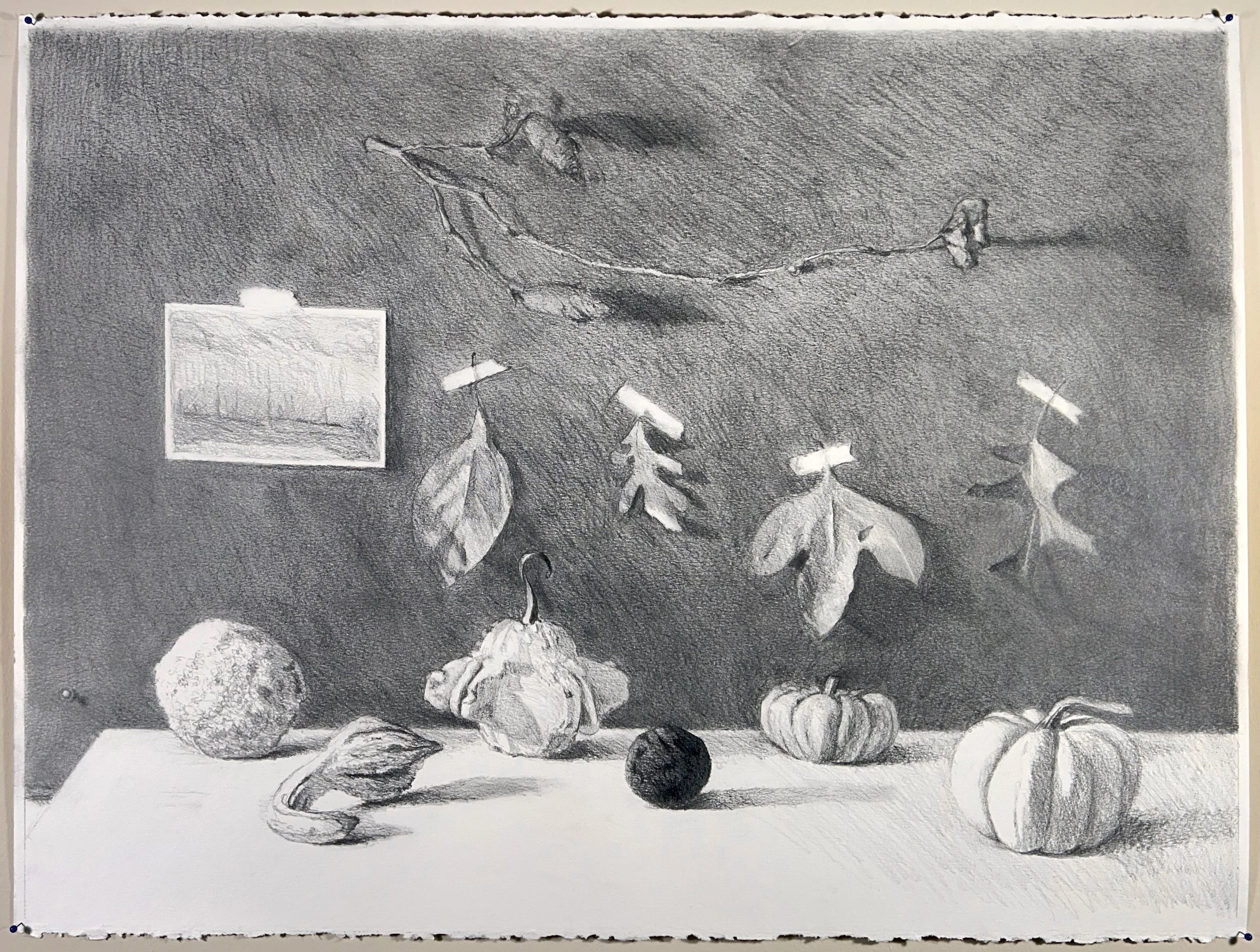
Regina U.
“I tried to set up a mix of autumn colors and different shapes and sizes of fruits and leave. It took me long to find a good combination of colors and shapes. For this I used the camera. I sketched different scenes and put things in and out, to find a good motive. I also sketched the fruits of roses to understand how it goes, but it didn’t worked out so well in my Aquarell. I travel at the moment (because of my job) so I had no possibility to redraw it so often.“
-
![]()
Jade H.
“This is my first still life I’ve ever made and also very first time attempting digital art. I had a lot of fun playing around with all the different brushes, textures and colors that procreate has to offer. I used one of the reference photos that NMA provided and started out by trying to measure with my pencil the main objects on the screen and applying a rough outline of size on my paper. Next I looked for shapes I recognized to try to outline. Pumpkins looked similar to circles, the backdrop of the wall and floor had rectangles and filled in details from there.
Next, I looked for shadow reflections that the objects created in the image to include and finished it up by adding color trying to be aware of when color values would be darker or lighter depending on the lighting in the photo.
This assignment not only allowed me to learn how to use procreate but it also worked perfectly alongside techniques I’m learning in Drawing Foundations I to prepare for that still life assignment as well.”
-
![]()
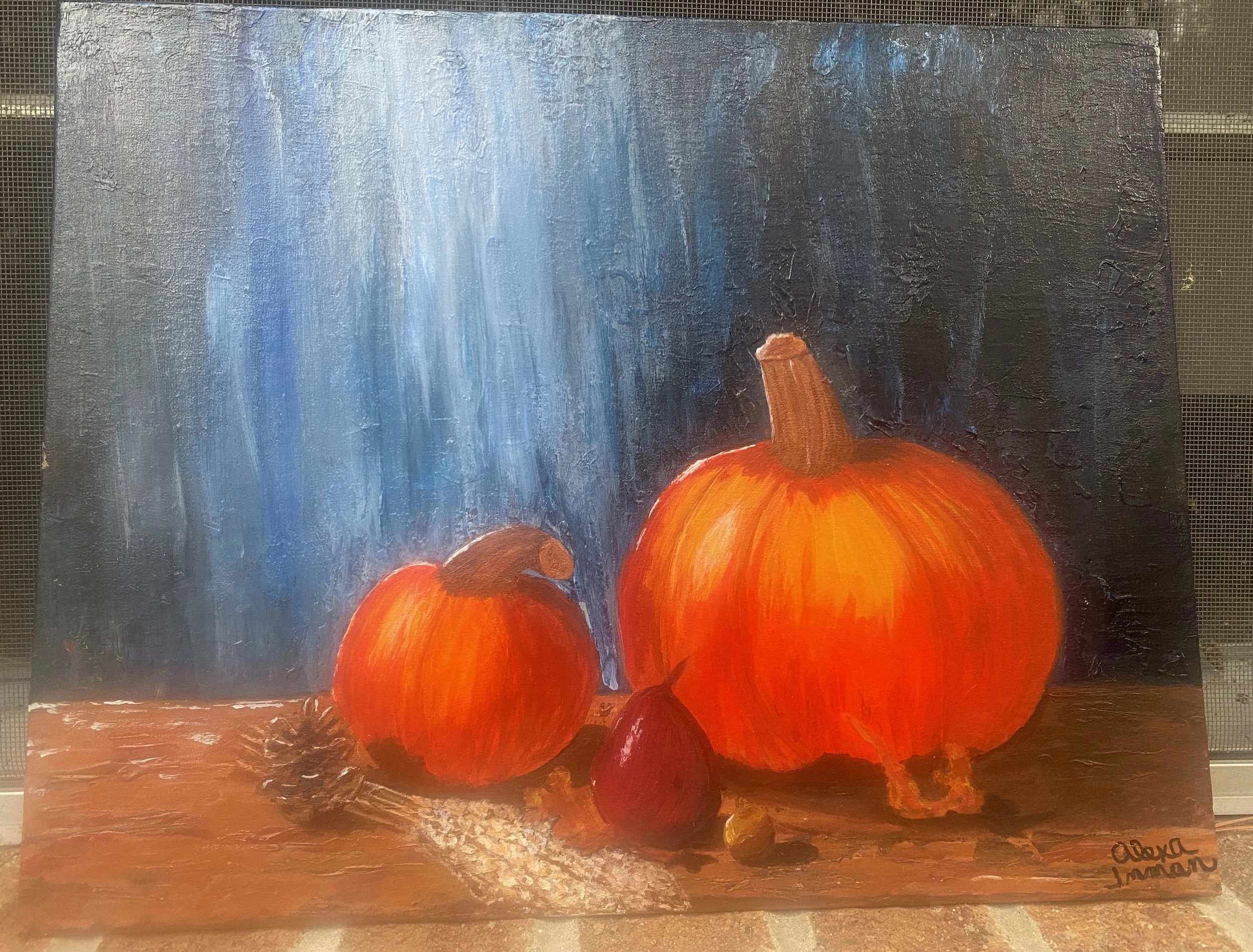
Alexa I.
“I used a reference photo provided by NMA. I am a beginner and was unsure of how to start, so I viewed a lot of still life paintings and watched some tutorials for instruction and inspiration. I sketched the scene with white charcoal and then used acrylic paint to lightly fill them in. I used a palette knife to add texture to both the background and table. I then used acrylic paint to finish painting the scene and add texture and shadow. It was very difficult to capture the painting with my camera, so I am submitting a few photos in different lighting trying to capture it best.“
-
![]()
CaraMia M.
“For this piece, I designed my composition from imagination, completing a few sketches and value studies to determine the lighting and key details. For the complex subjects, I found references from life and photos that were similar to what I had in mind. Working in oil, I quickly blocked in an underpainting combining the references and sketches, making adjustments as needed. I continued adding additional layers, adapted the references to fit my imagined composition, and revisited areas to ensure the elements worked cohesively. In the final stages, I used glazing to enhance the brighter colors and to strengthen the lighting scenario.“
-
![]()
Amanda W.
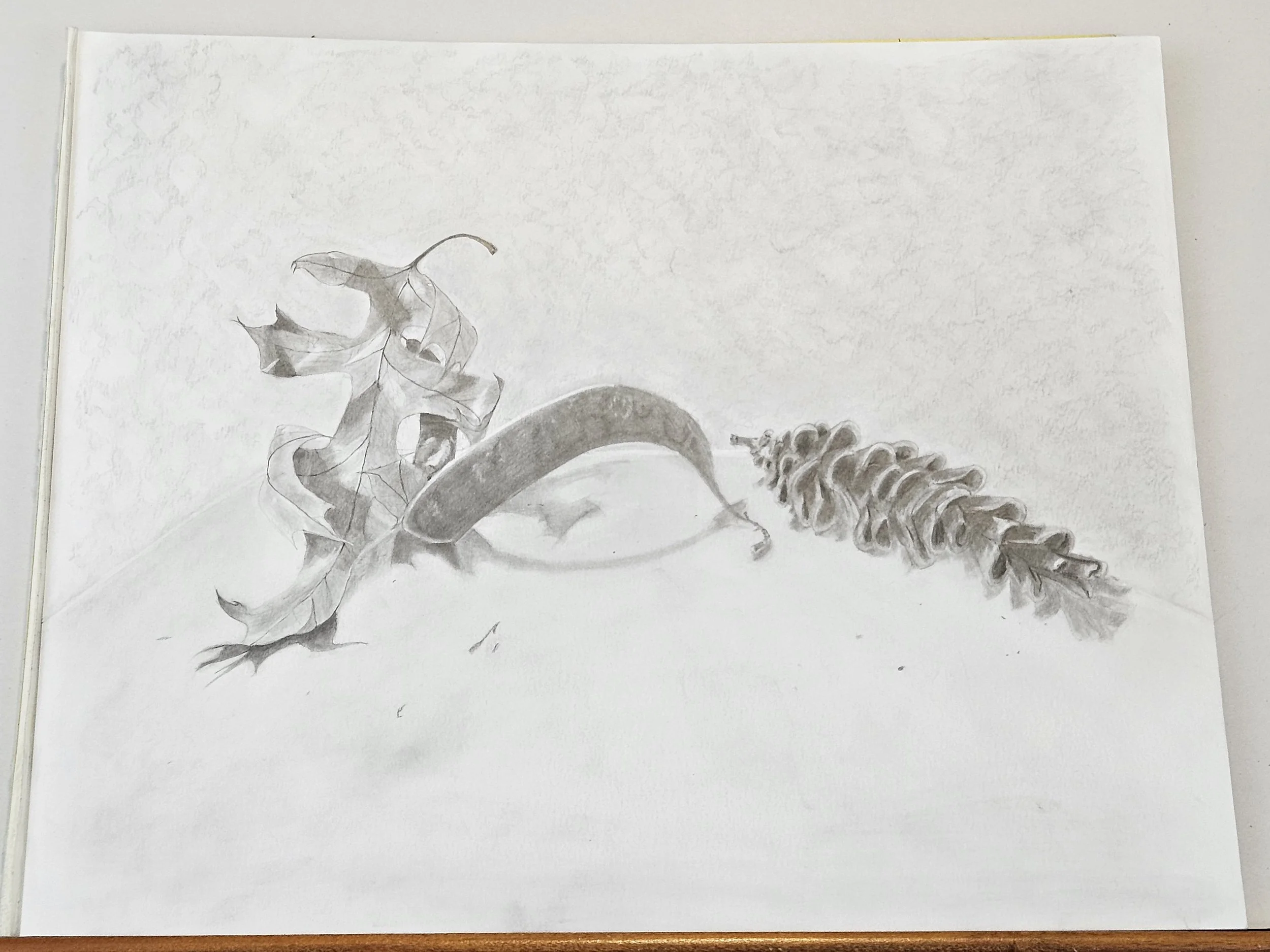
Leaf, Bean Pod and Pinecone.
Graphite on smooth bristol 11x17. Materials: Mechanical pencil 0.3 and 0.5 (B and HB), HB, 8B and Sanford Ebony, various blending tools.“I tried to incorporate many of the concepts from DF1's lessons 1-5. Started with basic measurements to lay in. Once I was feeling okay about the positioning, went into details, keeping everything light. I found myself adjusting positions as I began to build on detail. Not sure about the pinecone, I had trouble keeping track of it's complex, overlapping segments. I feel like I would approach it differently if I had to do it over.”
-
![]()
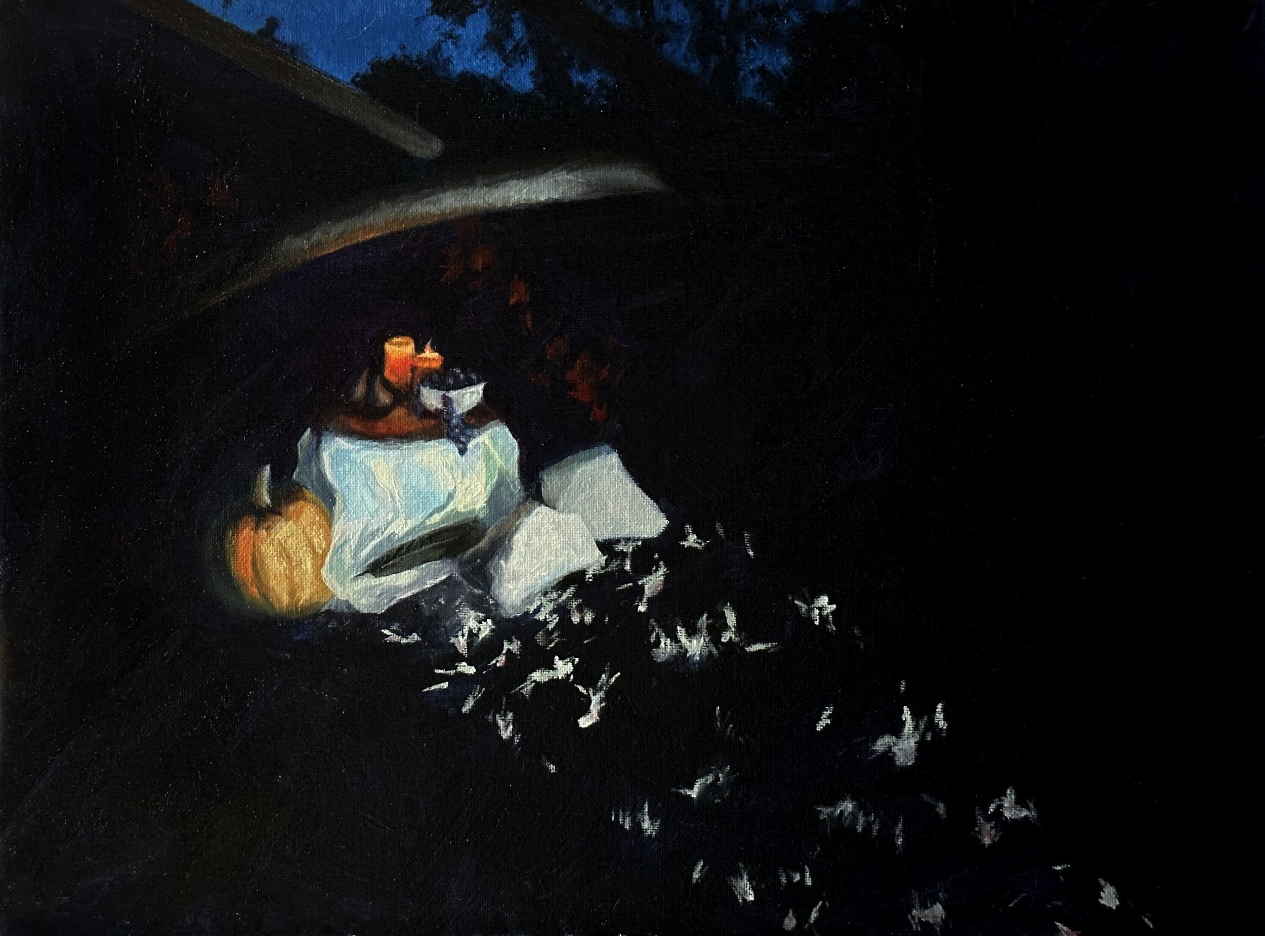
Anna M.
“I started by asking, ‘What does Autumn mean to me?’
The answer that came to me what that Autumn was about the darkening days, particularly in October when the difference between the warmth of the sun and the sudden chill of twilight is strongest. I wanted to capture the mysterious, adventurous feel of that time of day when things suddenly change.
I decided to set my still life in the middle of the woods, as if it was an altar stumbled upon by someone who drops their flashlight, startled.
The composition was challenging because I need to mentally stitch together two different reference images. (I couldn't actually set up the whole still life out in the woods at night - the location I scouted was in a public park.) It also contains three light sources, and I had decided to attempt the thing in oils (which I only started learning this summer).
I'm not satisfied with the final piece, but I'm glad I took on these challenges and attempted to capture a feeling I care about.”
-
![]()
Gemma A.
“My still life is inspired by locally grown flowers, fruits, and vegetables that might not be the first thing you think of for a Midwest harvest yet thrive in our chilly autumns.
The thumbnail process was very important for this piece. I had many configurations from my photo shoot, and while I loved some of the more complicated ones, I was very strict about finding an arrangement that was expressive rather than crowded.
Deciding to do a monochrome painting also influenced the composition because I needed the background to not compete for value space. I went for a graphic shape that emphasizes the wonderful shadow cast by the roses instead of detailing numerous fabric folds.
I used watercolor on an all material canvas board. I wanted the workability it provided but keeping the paint from swiping off constantly was a challenge.”
-
![]()
Dick K.
“I haven't learnt enough yet and so went with a (pastiche?) of some of my favourite early twentieth century still lifes, (for instance, those by a window). The vacant blue of the sky was intended to be an ambiguity in death (paradise or more likely nothingness). I did a few versions and found it so hard to repeat features I liked in earlier attempts. The three autumn elements are awkwardly staged rather than elegantly grouped. In one version they appeared as if attending to the end of the world just before the atomic blast took them out - still life indeed. In this final version, they are caught on stage in the precise moment when the jug has (appropriately) dried and the other two are frozen, not knowing how to continue the scene.”
-
![]()
Sara G.
Time Passes
16 x 20 Canvas
Zorn palette (except for underpainting which is Burnt Sienna)
Acrylic with palette knife (except for first layer underpainting)
Challenge: Limited palette, learn a new medium and technique.
Goal: Achieve an impressionistic painting with a halloween vibe.
Key words: Dusty, aged, forgotten
-
![]()
Hannah S.
“I started by setting up a still-life I was satisfied with. While choosing my objects, I kept in mind variations in shape, size, value, and texture. After going through a few setups, I decided on this scene, which I felt had a good triangle composition and overall rhythm that led the eye through each object.
I chose acrylic as my medium because it is something I have experience with using but would still provide a challenge. To stay within my current skillset, I limited myself to using only burnt sienna, ultramarine, black, and white paints (I suck at mixing colors).
My painting process started with making a few thumbnail sketches of value shapes. After choosing the one I was most happy with, I flowed through making a simple graphite sketch of my still-life, then transferring my sketch to my preferred canvas with transfer paper.
I glazed overtop my canvas board with a diluted burnt sienna and filled my background using loose brushstrokes. From there I filled in the foreground and objects, working from large to small details. Lastly, I applied strong highlights, darkened my stronger shadows, and glazed over some areas with burnt sienna and ultramarine to add a pop of color.“
-
![]()
Ori
“I started my placing rectangles for height and width. Then moved on to a more sophisticated construction for the 3D shape. After that i started blocking in some values, like a base mid tone, a modest core shadow and leaving some small areas I had marked white. After that I started darkening things slowly, calibrating each section to the others very inefficiently. After this point I would switch object to shade. And jump between that and rendering the previous, mostly so I could refresh my eyes a bit between them. After all the fruits we’re basically shaded I iterated and iterated till my time was out and my ability to judge the image was gone.”
-
![]()
Ruohan C.
“Hi there! 😊 This drawing is 18 by 23 inches and was created using soft pastels and pastel pencils on pastelmat. (and I'm sorry for the late submission, been moving and unpacking lately.)
It's my first attempt at a still life in color, and I've been learning to draw for about 11 months now. I'm happy with the result considering my limited experience with colors, this medium, and this type of paper. Although I faced many challenges, I enjoyed the process and learned a great deal.
Before starting, I gathered all the pastels I might need and decided to let the candlelight to be the focal point of this drawing. Following the guidance of Renae, I began by sketching basic shapes with a brown colored pencil to establish the structure. I adjusted proportions and placements a few times during this stage (I didn't create thumbnails beforehand but probably should have lol).
I then used soft pastels to block in primary shapes and colors and establish different values. Blocking in the shadow shapes of the first object I tried with colors, which is the orange vase, was challenging initially, but I managed to push through.
I spent a lot of time blending colors and figuring out the closest matches. Once the colors were in place, I used pastel pencils for finer details. This part also involved a lot of trial and error.
After completing the main elements and the background, I added another layer of dried cotton stems and highlighted the candle and its light. I acknowledge there are things to correct and adjust, but due to time constraints, I consider the drawing finished at this point. 🤗
Thank you for reading this and helping us improve!! 💕”
-
![]()
Czerina J.
Oil on canvas 18x14"
“Did the drawing first in graphite and sprayed with fixative. Started with an underpainting of Golden Fluids Nickel Azo Yellow and Quinacridone Nickel Azo Gold. Checked on my drawing to get the values.
At this stage, I did a bit of experimenting with the underpainting using Holbein Oil Quinacridone Opera for the dark values. A bit scary at this stage to get the glow of the autumn. Right now I can't recall what oil paint I used for most of the underpainting aside from the Quinacridone Opera.
Then I washed it with Transparent Red Oxide and Alizarin Crimson and rubbed all the areas with Gamsol to get the highlights. I already have an album swatch of oil palette for reference. Really helped having done that exercise. I used Cadmium Yellow, Cad Yellow Deep, Cad Orange, Yellow Ochre, Cad Red, Alizarin Crimson, Viridian, Ultramarine Blue, Cobalt Blue with Transparent Red Oxide as the prominent color.
Renae Wang's Figure in Environment and Fundamentals of Drawing and Perspective.
Then glazed with Indian yellow to achieve the glow. This is quite a scary project for me and took a lot of work and thinking. Really challenging! I can't remember how long was the painting time, quite long. 😅
Classes that helped me with this project was Renae Wang's Figure in Environment and Fundamentals of Drawing and Perspective. She had exercises on pumpkins and painting a sphere in oil, candlelit.Catherine Bobkoski's Oil Painting Master Copies Part 1 and Charcoal Master Copies. Of course BGD!
Drawing in charcoal helped in learning the nuances of values, painting in grayscale etc... I wouldn't have been able to execute the painting without those classes. It just gives a better understanding and direction on how to tackle the painting.
All in all this is a great assignment. I'm grateful for the learning process!”
-
![]()
Amélie D.
“It’s difficult to explain my process. It was full of doubts, scare and trials.
At first, I wanted to set up my own still-life. I didn't find the materials I’d have liked to work with and the lack of light and space in my place made me give up this idea.
Plus, let’s be honest, the references provided by the NMA were too good to not be used.
I made a couple of thumbnails of different images to see which composition was the most appellant. I really like the height provided by the flowers even if the basket scared me a lot (and still continues to scare me ). I decided to take it as a challenge and try.
I thought about making a full graphite still-life. After some research, I tried with colored pencils to finally go all-in in the final piece and use watercolors.
I am not used to colors and usually, it’s something I avoid. But it was already a challenge and why not make it a full challenge?
For me, my biggest mistake was to wait a lot between the sketching and the painting phase. There were a lot of things to fix on the sketch but, after waiting weeks in between, I just didn’t want to go back to the sketch and wanted to finish it.
And without surprise, it wasn’t a good idea. Maybe I should have stuck to colored pencils but, even if it was a big mess, I enjoyed doing it with watercolors and I learned a lot.
It’s easy to see that I struggled a lot, especially on the basket, the colors are messy but I am happy to have totally gone out of my comfort zone for this assignment.”
-
![]()
Keith C.
“Watercolour, from NMA reference, added cat and mouse. ps this was already submitted by email some time ago.”
-
![]()
Alhvi B.
“I did a few studies of the shapes with graphite.
I had planned to do several tryouts of the shading and rendering, but I couldn't at the end.
So I did my first try on the shading on the final drawing.
I used graphite to draw the shapes and then charcoal to do the shading.
I believe I should have used a wider range of values, as I find the values too close together.
Also as I was blending the charcoal, I had issues where shapes intersected or in the edges of the shapes.
I'm eager to check out our review session :).”
-
![]()
Jenny P.
“I used a photo from Autumn's Bounty photo references for my still life. For materials, I used Strathmore sketch paper 18 in x 24 in, and graphite pencil. I did a thumbnail sketch, then I started on bigger paper.”
-
![]()
Andrea K.
“I followed the steps for the drawing we did in the FoDaP course with Renae. The whole drawing was done in 3b pencil, a blender and kneaded eraser. For highlights I used white charcoal. I also did some first thumbnails to get the proportions right. Which is a big challenge, getting the right proportions.”
-
![]()
Harmony H.
“I've written a paper describing my process and am submitting it with the drawing, along with a slides of images to accompany the paper.”
-
![]()
Oliver S.
“The final piece was done with charcoal on paper. Several arrangements have been set up and sketched before deciding for the presented composition.”
-
![]()
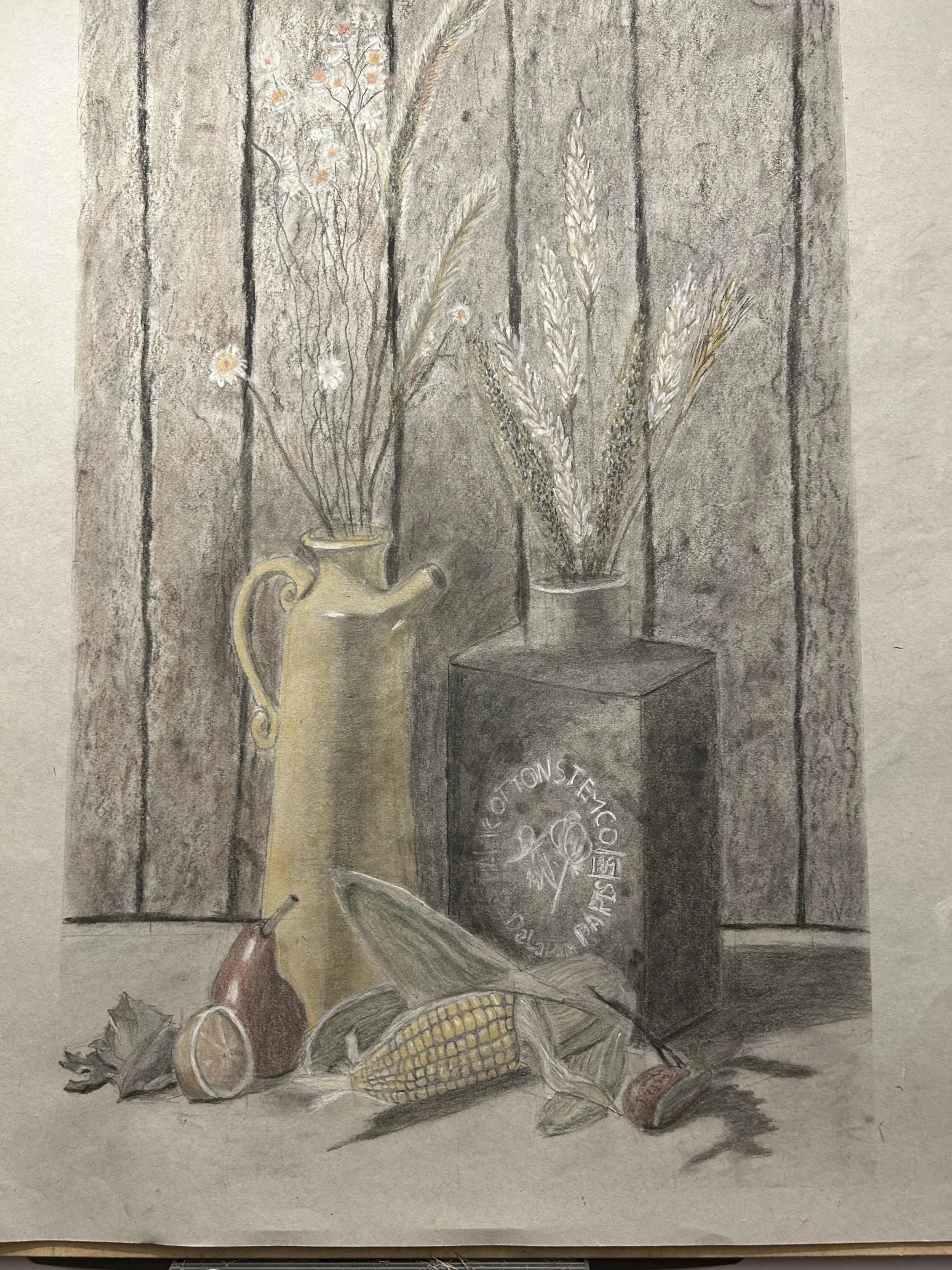
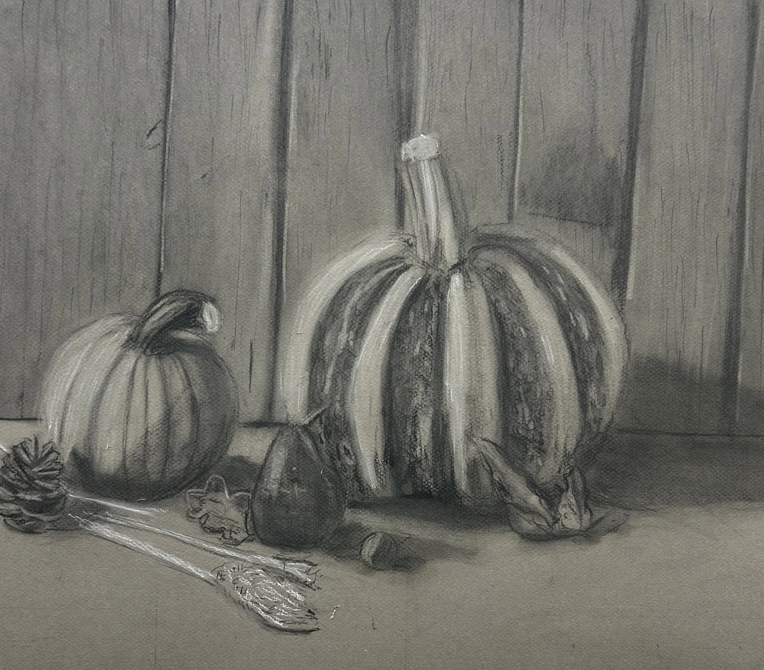
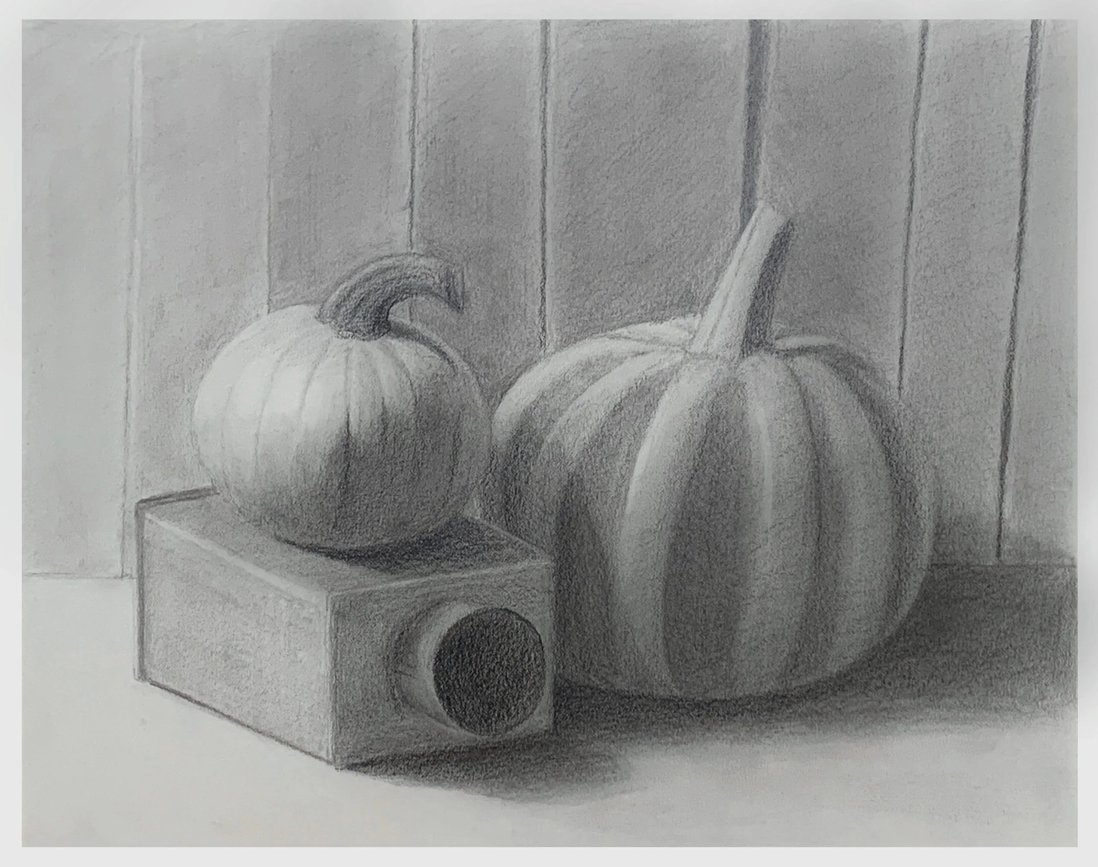
Dhitabhorn M.
- Envelope and rough contour while keeping an eye on the composition and deciding the focal point (which was the tin box at first, and I tried to refine the edges as much as I am able, but I had more knowledge of rendering a pumpkin, so that ended up with the most contrast and detail)
- Measure and tighten the lines as much as able.
- Block in the shadows.
- Separate into 3 main values (this is where I started having trouble, because I didn’t do any rendered pieces lately)
-Pushed the shadows and added highlights, tried to establish values of different objects a bit more.
-Sharpen any edges between obvious value differences.
-
![]()
Clojure
“Limited palette pastels. I set up my still life and lit it. I did several small value studies and used it for my charcoal drawing foundations 1 week 8 submissions. After noticing the reflections with various colors, I decided to do it again for this assignment, but in pastels. Again, I did a quick value study, a smaller color group study to ensure my limited palette worked and a quick outline drawing to make sure it would fit on my final paper. For the pastels work, I immediately started working with local color using very soft pastels. Towards the end I started using a few pastel pencils and harder pastels for detail. No underpainting.
As I worked on this, my initial intentions was to do as realistic study as I could with the palette I had. However, I realized I really liked the juxtaposition of the barely rendered plate with the more realistic objects in front of it so that is what you see in the final piece.”
-
![]()
Esme B.
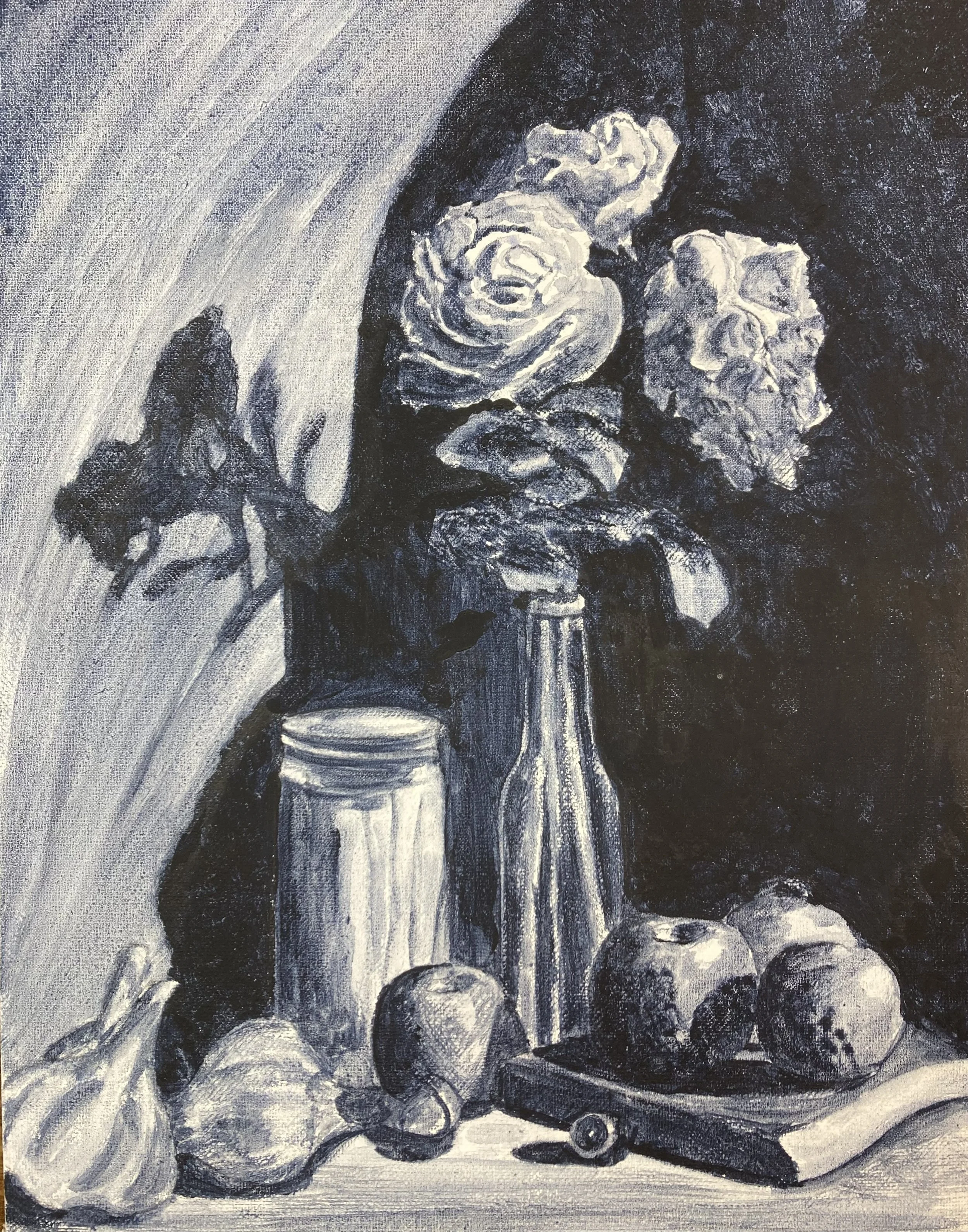
“I selected one of NMA's images. Using 11x14" Bristol Smooth, I began my sketch by using the envelope and contour method as described by Renae Wang in her course Fundamentals of Drawing and Perspective.
I adjusted any areas I spotted as being inaccurate as I went. Once I was happy I began by shading in with a light hand using a 2B Faber Castle pencil, shading all areas that was a darker value than the lightest tonal area.
Once the entire page had been done in this way I moved onto a 4B FC pencil working on the next tonal area still using a light hand going over the previous shading, at the end of this I had a 3 toned drawing.
I then continued in this manner using a 6B and then 8B FC pencil. To give the illusion of the candle burning in the area that was included in the shaded area I used a putty rubber to gently remove some shade trying to feather it out.
After this I felt the shadow area was not dark enough and the drawing did not read correctly and so used a 10B FC pencil to go over the shadow areas.
Once finished I scanned it into my computer saving it as a jpg.”
-
![]()
Benedict M.
“I tried to do it in the Style of Raena Wang, with Charcoal and a dark background. Tried to get the drawing solid and then aded shadows after that the middletones.”
-
![]()
Martine R.
“For this still life I chose to paint fuyu persimmons as I love their cute, squat shape and their bright orange colour. I experimented with various setups and in the end chose a set up with colours that complimented the persimmons in colour (i.e. Blue, brown and white).
I wanted to experiment with a (somewhat) limited palette, and used Cadmium Yellow Medium, Cadmium Red Light, Alizarin Crimson, Ultramarine Blue, Burnt Umber and Titanium White.
This is basically my first still life ever and one of the few times I've painted with oil paints in a serious manner so... I kind of just dove in not having a clue what I should be doing or how to use "oil painting medium".
I tried to stick to the rule of going from dark to light, but at times I kind of lost my way and just focused on working on one object in the painting until it felt a little less abstract.
I often went to the Discord channel for advice, but was not always able to directly apply it. I think I just need time to process things and practice more. But if it wasn't for the Discord channel I probably would've given up!
While every part of the painting gave me trouble, for me the highlight was the rim of the cup. I tried to un-sausage it as per Marian's request, probably five times, but it looks like for now it just really wants to be a sausage. XD
The same goes for the patterning on the cup, I had a lot of trouble with the blue paint mixing with the white paint. I tried to thin it with oil, so it would kind of float on top of the white. But, being so focused on getting the paint on there made me forget about perspective for a bit.
I don't consider this painting finished, but in light of the (expired) deadline I feel like this is the most I can do for now.
I will continue working on it on and off as I learn more skills via classes and practice.
While it took me a while to warm up to it, I absolutely loved this assignment and look forward to the next one!”
-
![]()
Eric B.
“Started with gouache then after the general shapes and colors were filled in, moved to Photoshop brushes to help with colors such as the shadows and lighting. First time w/ gouache and beginner w/ Photoshop.”
-
![]()
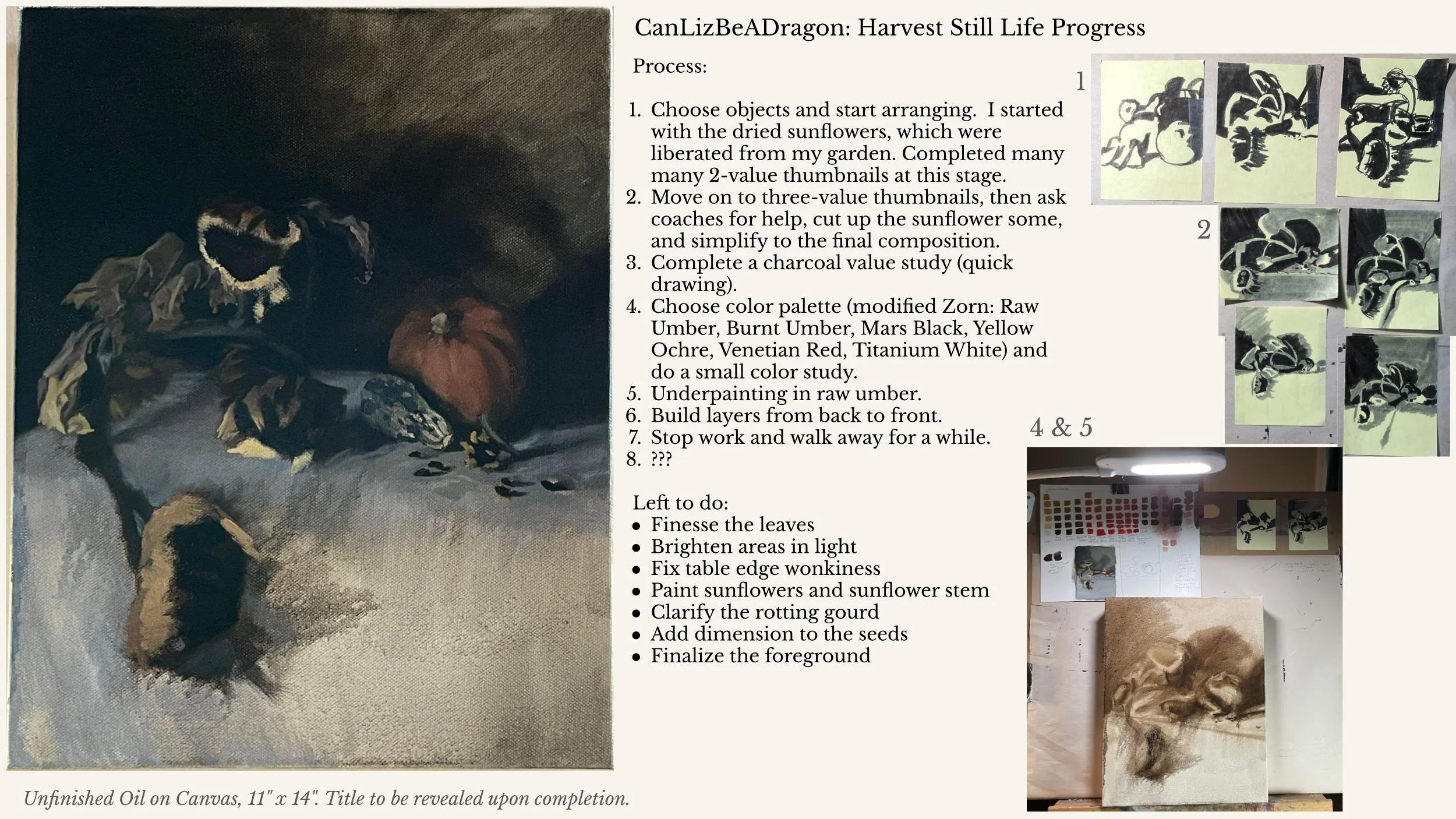
Liz H.
Process:
1. Choose objects and start arranging. I started with the dried sunflowers, which were liberated from my garden. Completed many many 2-value thumbnails at this stage.
2. Move on to three-value thumbnails, then ask coaches for help, cut up the sunflower some, and simplify to the final composition.
3. Complete a charcoal value study (quick drawing).
4. Choose color palette (modified Zorn: Raw Umber, Burnt Umber, Mars Black, Yellow Ochre, Venetian Red, Titanium White) and do a small color study.
Underpainting in raw umber.
5. Build layers from back to front.
Left to do:
- Finesse the leaves
- Brighten areas in light
- Fix table edge wonkiness
- Paint sunflowers and sunflower stem
- Clarify the rotting gourd
- Add dimension to the seeds
- Finalize the foreground
-
![]()
David C.
“Still a work in progress. I used willow charcoal on smooth paper. My only experience with still life's is from FODAP so I tried to apply what I learnt for this piece.”
-
![]()
Ken H.
“I have a tendency to just copy from the reference, so a big goal for me was to change a number of things in my drawing and to try to apply some of the lessons I learned in Bill's Composition Live Class.
I've attached an images that summarizes the processed I used for this piece. For the final drawing, I followed the process from FoDaP, as I remember it. Before getting into the actual drawing, I did a few different value studies. I wanted the final to have more dynamic lighting than the original, so I played with that. I also did a couple of digital draw overs to play with the lighting and attempted to identify some rhythms from the reference that I wanted to keep as well as some that I wanted to change. Then I just got into the final drawing.
Overall, I'm reasonably pleased with how it turned out. I think it's representative of where I am in my skills today. The final drawing was done on gray toned paper with black and white charcoal pencil. It's 14 x 16 inches. I took a number of different photos of the final using both artificial and natural light on a cloudy day, but it was always more blown out than the original.
I tried different angles of lighting and played with different camera settings in the pro mode of my phone's camera. The second to last picture in the process image that I've included is the best I could get. It still wasn't quite accurate, so I brought the image into Gimp, and made some minor adjustments using levels to push the darks down to what they should be. I've included the result as the final edited photo. Thank you for having a look at my submission!”